1
Dials & Gauges
Blockset
®
For Use with Simulink
Modeling
Simulation
Implementation
User’s Guide
Version 1
How to Contact The MathWorks:
www.mathworks.com
comp.soft-sys.matlab
Web
Newsgroup
info@mathworks.com
Technical support
Product enhancement suggestions
Bug reports
Documentation error reports
Order status, license renewals, passcodes
Sales, pricing, and general information
508-647-7000
Phone
508-647-7001
Fax
The MathWorks, Inc.
3 Apple Hill Drive
Natick, MA 01760-2098
Mail
support@mathworks.com
suggest@mathworks.com
bugs@mathworks.com
doc@mathworks.com
service@mathworks.com
For contact information about worldwide offices, see the MathWorks Web site.
Dials & Gauges Blockset User’s Guide
COPYRIGHT 1999 - 2001 by The MathWorks, Inc.
The software described in this document is furnished under a license agreement. The software may be used
or copied only under the terms of the license agreement. No part of this manual may be photocopied or reproduced in any form without prior written consent from The MathWorks, Inc.
FEDERAL ACQUISITION: This provision applies to all acquisitions of the Program and Documentation by
or for the federal government of the United States. By accepting delivery of the Program, the government
hereby agrees that this software qualifies as "commercial" computer software within the meaning of FAR
Part 12.212, DFARS Part 227.7202-1, DFARS Part 227.7202-3, DFARS Part 252.227-7013, and DFARS Part
252.227-7014. The terms and conditions of The MathWorks, Inc. Software License Agreement shall pertain
to the government’s use and disclosure of the Program and Documentation, and shall supersede any
conflicting contractual terms or conditions. If this license fails to meet the government’s minimum needs or
is inconsistent in any respect with federal procurement law, the government agrees to return the Program
and Documentation, unused, to MathWorks.
MATLAB, Simulink, Stateflow, Handle Graphics, and Real-Time Workshop are registered trademarks, and
Target Language Compiler is a trademark of The MathWorks, Inc.
Other product or brand names are trademarks or registered trademarks of their respective holders.
Printing History: September 1999 Online only
September 2000 First printing
May 2001
Online only
New for Version 1.0
Revised for Version 1.1 (Release 12)
Revised for Version 1.2 (Release 12.1)
Contents
Getting Started
1
What Is the Dials & Gauges Blockset? . . . . . . . . . . . . . . . . . . . 1-2
Related Products . . . . . . . . . . . . . . . . . . . . . . . . . . . . . . . . . . . . . 1-3
External Mode Support . . . . . . . . . . . . . . . . . . . . . . . . . . . . . . . . 1-4
Real-Time Workshop Support . . . . . . . . . . . . . . . . . . . . . . . . . . . 1-5
Accessing the Preconfigured Blocks . . . . . . . . . . . . . . . . . . . .
Using the dnglib Command . . . . . . . . . . . . . . . . . . . . . . . . . . . .
Using the Simulink Library Browser . . . . . . . . . . . . . . . . . . . . .
Configuring the Dials & Gauges Blockset . . . . . . . . . . . . . . . . .
1-6
1-6
1-7
1-9
Moving and Selecting Blocks . . . . . . . . . . . . . . . . . . . . . . . . . 1-11
Building a Simple Model . . . . . . . . . . . . . . . . . . . . . . . . . . . . .
The Original Simulink Model . . . . . . . . . . . . . . . . . . . . . . . . . .
Replacing Simulink Blocks with Instrumentation . . . . . . . . .
Building the Model . . . . . . . . . . . . . . . . . . . . . . . . . . . . . . . . . .
1-12
1-12
1-12
1-13
Working with a Model . . . . . . . . . . . . . . . . . . . . . . . . . . . . . . . .
Running the Simulation . . . . . . . . . . . . . . . . . . . . . . . . . . . . . .
Saving the Model . . . . . . . . . . . . . . . . . . . . . . . . . . . . . . . . . . . .
Printing the Model . . . . . . . . . . . . . . . . . . . . . . . . . . . . . . . . . .
1-15
1-15
1-15
1-16
Modifying Properties of Blocks . . . . . . . . . . . . . . . . . . . . . . .
Accessing the Properties . . . . . . . . . . . . . . . . . . . . . . . . . . . . . .
Example Modifying Properties . . . . . . . . . . . . . . . . . . . . . . . . .
Learning More About Properties . . . . . . . . . . . . . . . . . . . . . . .
1-17
1-17
1-18
1-19
i
Using Instrumentation in a Model
2
Connecting Blocks in a Model . . . . . . . . . . . . . . . . . . . . . . . . . . 2-3
Modifying ActiveX Control Properties . . . . . . . . . . . . . . . . . . 2-4
Using Multiple Styles Within One Block . . . . . . . . . . . . . . . . . . 2-4
Understanding ID Properties . . . . . . . . . . . . . . . . . . . . . . . . . . . 2-7
Displaying Text on a Block . . . . . . . . . . . . . . . . . . . . . . . . . . . . . 2-8
Controlling Values with the Mouse . . . . . . . . . . . . . . . . . . . . . . 2-10
Modifying the Displayed Range . . . . . . . . . . . . . . . . . . . . . . . . 2-12
Modifying Multiple Tick Marks . . . . . . . . . . . . . . . . . . . . . . . . . 2-15
Saving and Reusing a Customized Control . . . . . . . . . . . . . 2-19
Categories of ActiveX Controls
3
Angular Gauges . . . . . . . . . . . . . . . . . . . . . . . . . . . . . . . . . . . . . . . 3-3
Customizing Angular Gauges . . . . . . . . . . . . . . . . . . . . . . . . . . . 3-3
Buttons & Switches . . . . . . . . . . . . . . . . . . . . . . . . . . . . . . . . . . . 3-6
Customizing Buttons and Switches . . . . . . . . . . . . . . . . . . . . . . 3-6
Changing Output Values . . . . . . . . . . . . . . . . . . . . . . . . . . . . . . . 3-7
Knobs & Selectors . . . . . . . . . . . . . . . . . . . . . . . . . . . . . . . . . . . . . 3-8
Customizing the Generic Knob Block . . . . . . . . . . . . . . . . . . . . . 3-9
Customizing the Frequency Selector Block . . . . . . . . . . . . . . . 3-10
Creating a New Set of Selections . . . . . . . . . . . . . . . . . . . . . . . 3-11
Changing Output Values . . . . . . . . . . . . . . . . . . . . . . . . . . . . . . 3-13
LEDs . . . . . . . . . . . . . . . . . . . . . . . . . . . . . . . . . . . . . . . . . . . . . . . . 3-14
Customizing LEDs . . . . . . . . . . . . . . . . . . . . . . . . . . . . . . . . . . . 3-14
Linear Gauges . . . . . . . . . . . . . . . . . . . . . . . . . . . . . . . . . . . . . . . 3-16
Customizing Linear Gauges . . . . . . . . . . . . . . . . . . . . . . . . . . . 3-17
ii
Contents
Numeric Displays . . . . . . . . . . . . . . . . . . . . . . . . . . . . . . . . . . . . 3-19
Customizing Numeric Displays . . . . . . . . . . . . . . . . . . . . . . . . . 3-19
Customizing the Odometer Block . . . . . . . . . . . . . . . . . . . . . . . 3-20
Percent Indicators . . . . . . . . . . . . . . . . . . . . . . . . . . . . . . . . . . . 3-21
Customizing Percent Indicators . . . . . . . . . . . . . . . . . . . . . . . . 3-21
Sliders . . . . . . . . . . . . . . . . . . . . . . . . . . . . . . . . . . . . . . . . . . . . . . 3-24
Customizing Sliders . . . . . . . . . . . . . . . . . . . . . . . . . . . . . . . . . . 3-24
Strip Chart . . . . . . . . . . . . . . . . . . . . . . . . . . . . . . . . . . . . . . . . . . 3-27
Using Your Own ActiveX Control . . . . . . . . . . . . . . . . . . . . . .
Adding the ActiveX Control Block to a Model . . . . . . . . . . . . .
Summary of Dialog Box Fields and Check Boxes . . . . . . . . . . .
Program ID . . . . . . . . . . . . . . . . . . . . . . . . . . . . . . . . . . . . . . . . .
Connections . . . . . . . . . . . . . . . . . . . . . . . . . . . . . . . . . . . . . . . .
Input Property . . . . . . . . . . . . . . . . . . . . . . . . . . . . . . . . . . . . . .
Output Property . . . . . . . . . . . . . . . . . . . . . . . . . . . . . . . . . . . . .
Event on Which to Output . . . . . . . . . . . . . . . . . . . . . . . . . . . . .
Initialization Command . . . . . . . . . . . . . . . . . . . . . . . . . . . . . . .
Other Events and Handlers . . . . . . . . . . . . . . . . . . . . . . . . . . . .
Update Command . . . . . . . . . . . . . . . . . . . . . . . . . . . . . . . . . . .
In-Block Control . . . . . . . . . . . . . . . . . . . . . . . . . . . . . . . . . . . . .
Border . . . . . . . . . . . . . . . . . . . . . . . . . . . . . . . . . . . . . . . . . . . . .
Notes on Third-Party ActiveX Control Blocks . . . . . . . . . . . . .
3-28
3-28
3-29
3-30
3-30
3-30
3-31
3-31
3-32
3-32
3-32
3-33
3-33
3-34
Placing ActiveX Controls in a Different Window
4
Placing ActiveX Controls in a Different Model . . . . . . . . . . . 4-3
Creating a Model Window Containing Gauges . . . . . . . . . . . . . 4-3
Associating the Main Model with the Gauges . . . . . . . . . . . . . . 4-6
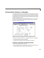
Placing ActiveX Controls in a Subsystem . . . . . . . . . . . . . . . . 4-8
Creating a Subsystem Containing Gauges . . . . . . . . . . . . . . . . . 4-8
Associating Top-Level Blocks with the Subsystem . . . . . . . . . . 4-9
iii
Placing ActiveX Controls in a Figure Window . . . . . . . . . . 4-10
Saving and Reopening the Model . . . . . . . . . . . . . . . . . . . . . . . 4-12
Library Reference
5
iv
Contents
Angular Gauges . . . . . . . . . . . . . . . . . . . . . . . . . . . . . . . . . . . . . . 5-3
Buttons & Switches . . . . . . . . . . . . . . . . . . . . . . . . . . . . . . . . . . . 5-5
Knobs & Selectors . . . . . . . . . . . . . . . . . . . . . . . . . . . . . . . . . . . . 5-6
LEDs . . . . . . . . . . . . . . . . . . . . . . . . . . . . . . . . . . . . . . . . . . . . . . . 5-8
Linear Gauges . . . . . . . . . . . . . . . . . . . . . . . . . . . . . . . . . . . . . . . 5-9
Numeric Displays . . . . . . . . . . . . . . . . . . . . . . . . . . . . . . . . . . . . 5-11
Percent Indicators . . . . . . . . . . . . . . . . . . . . . . . . . . . . . . . . . . . 5-13
Sliders . . . . . . . . . . . . . . . . . . . . . . . . . . . . . . . . . . . . . . . . . . . . . 5-14
Strip Chart . . . . . . . . . . . . . . . . . . . . . . . . . . . . . . . . . . . . . . . . . 5-15
1
Getting Started
What Is the Dials & Gauges Blockset?
. . . . . . . . 1-2
Related Products . . . . . . . . . . . . . . . . . . 1-3
External Mode Support . . . . . . . . . . . . . . . . 1-4
Real-Time Workshop Support . . . . . . . . . . . . . 1-5
Accessing the Preconfigured Blocks
Using the dnglib Command . . . . .
Using the Simulink Library Browser .
Configuring the Dials & Gauges Blockset
Moving and Selecting Blocks
.
.
.
.
.
.
.
.
.
.
.
.
.
.
.
.
.
.
.
.
.
.
.
.
.
.
.
.
.
.
.
.
.
.
.
.
1-6
1-6
1-7
1-9
. . . . . . . . . . . . 1-11
Building a Simple Model . . . . . . . . .
The Original Simulink Model . . . . . . . . .
Replacing Simulink Blocks with Instrumentation
Building the Model . . . . . . . . . . . . .
.
.
.
.
.
.
.
.
.
.
.
.
.
.
.
.
. 1-12
. 1-12
. 1-12
. 1-13
Working with a Model
Running the Simulation .
Saving the Model . . . .
Printing the Model . . .
.
.
.
.
.
.
.
.
.
.
.
.
.
.
.
.
.
.
.
.
.
.
.
.
.
.
.
.
.
.
.
.
.
.
.
.
.
.
.
.
.
.
.
.
.
.
.
.
.
.
.
.
.
.
.
.
. 1-15
. 1-15
. 1-15
. 1-16
Modifying Properties of Blocks
Accessing the Properties . . . . .
Example Modifying Properties . .
Learning More About Properties .
.
.
.
.
.
.
.
.
.
.
.
.
.
.
.
.
.
.
.
.
.
.
.
.
.
.
.
.
.
.
.
.
.
.
.
.
.
.
.
.
. 1-17
. 1-17
. 1-18
. 1-19
1
Getting Started
Getting Started11
What Is the Dials & Gauges Blockset?
The Dials & Gauges Blockset is a collection of blocks that provides graphical
instrumentation for monitoring and controlling signals and parameters in
Simulink® models. Using the Dials & Gauges Blockset, you can set up
realistic-looking instruments that are custom-designed for your Simulink
model and visually representative of the environment that you are modeling.
Typical applications of the Dials & Gauges Blockset include:
• Automobile dashboard prototyping
• Airplane cockpit prototyping
• Control room and process instrumentation
• Communications and power system simulation
• Prototyping of control, communications, and medical instrumentation
The Dials & Gauges Blockset requires MATLAB® and Simulink. It uses
ActiveX technology and runs only on Microsoft Windows platforms.
1-2
Related Products
Related Products
The MathWorks provides several products that are especially relevant to the
kinds of tasks you can perform with the Dials & Gauges Blockset. In particular,
the Dials & Gauges Blockset requires these products:
• MATLAB
• Simulink
For more information about any of these products, see either:
• The online documentation for that product, if it is installed or if you are
reading the documentation from the CD
• The MathWorks Web site, at http://www.mathworks.com; see the “products”
section
Note The toolboxes listed below all include functions that extend MATLAB’s
capabilities. The blocksets all include blocks that extend Simulink’s
capabilities.
Product
Description
Data Acquisition Toolbox
MATLAB functions for direct access to live,
measured data from MATLAB
DSP Blockset
Simulink block libraries for the design,
simulation, and prototyping of digital signal
processing systems
Fixed-Point Blockset
Simulink blocks that model, simulate, and
automatically generate pure integer code for
fixed-point applications
Instrument Control
Toolbox
Tool for communicating with instruments that
support the GPIB (IEEE-488, HPIB) interface,
the VISA standard, or the serial port interface
1-3
1
Getting Started
Product
Description
Power System Blockset
Simulink block libraries for the design,
simulation, and prototyping of electrical power
systems
Real-Time Windows
Target
Tool that allows you to run Simulink models
interactively and in real time on your PC
under Windows
Real-Time Workshop
Tool that generates customizable C code from
Simulink models and automatically builds
programs that can run in real time in a variety
of environments
Simulink
Interactive, graphical environment for
modeling, simulating, and prototyping
dynamic systems
Stateflow
Tool for graphical modeling and simulation of
complex control logic
Virtual Reality Toolbox
Tool for viewing and animating 3-D worlds
through MATLAB and Simulink
xPC Target
Tool for adding I/O blocks to Simulink block
diagrams and downloading the code generated
by Real-Time Workshop to a second PC that
runs the xPC Target real-time kernel, for rapid
prototyping and hardware-in-the-loop testing
of control and DSP systems
External Mode Support
The Dials & Gauges Blockset support for external mode allows you to
incorporate dials and gauges into any target that you can connect to through
external mode (such as the xPC Target and Real-Time Windows Target
environments; see the documentation for those products for details).
For more information about external mode, see the external mode section of the
Real-Time Workshop User’s Guide.
1-4
Related Products
Real-Time Workshop Support
You can use Real-Time Workshop® 4.0 or later to generate code from models
that include Dials & Gauges Blockset blocks.
For dials, the code you generate contains static values (that is, the value
specified at the time of code generation). Gauges are ignored during code
generation, except through the use of external mode (see below). If you want to
manipulate dials and view the gauges, you can do so through the external mode
in Real-Time Workshop.
1-5
1
Getting Started
Accessing the Preconfigured Blocks
The Dials & Gauges Blockset contains many preconfigured blocks, via the
Global Majic ActiveX Library. To access these blocks, follow the procedures
described in one of these two sections:
• “Using the dnglib Command”
• “Using the Simulink Library Browser” on page 1-7
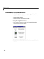
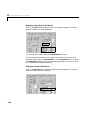
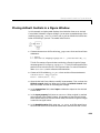
Using the dnglib Command
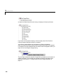
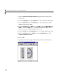
1 Enter the dnglib command in the MATLAB Command Window, which
causes the following window to appear.
2 Double-click on the Global Majic ActiveX Library icon to access the libraries
it contains.
1-6
Accessing the Preconfigured Blocks
Each icon represents a different library of blocks. Double-click on an icon to
access the blocks in the library. If they all say “ActiveX” and do not look like
graphical instruments, then follow the instructions in “Configuring the Dials
& Gauges Blockset” on page 1-9. Each library also includes a question-mark
block that provides access to online help for the ActiveX controls in that library.
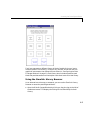
Using the Simulink Library Browser
As an alternative to the dnglib command, you can use the Simulink Library
Browser to access the preconfigured blocks:
1 Open the Dials & Gauges Blockset by clicking on the plus sign to the left of
the blockset name. This displays the listing for the Global Majic ActiveX
Library.
1-7
1
Getting Started
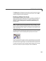
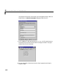
2 Open the Global Majic ActiveX Library to display its libraries of blocks.
If you click on the name of a library, then the right pane of the Simulink
Library Browser displays the library’s contents.
You can also view the blocks as instruments in a library window by
right-clicking on the library name, and then selecting the option that appears.
For example, the figure below shows the context menu that appears when you
right-click on the Angular Gauges listing.
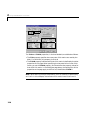
.
The next figure shows the Angular Gauges library contents as instruments in
a library window. If the window you see does not look like the figure, then
follow the instructions in “Configuring the Dials & Gauges Blockset” on
page 1-9.
1-8
Accessing the Preconfigured Blocks
Configuring the Dials & Gauges Blockset
Normally, the installation process automatically registers the ActiveX controls
associated with the Dials & Gauges Blockset. However, in exceptional cases
you might see an error message referring to an .ocx component, similar to the
following message:
Copying Dials & Gauges Blockset files
ads.ocx self registering file did not register
If you see such a message, or if the graphical instruments do not appear on the
blocks in this blockset, then try one of the following:
1-9
1
Getting Started
• Enter dng_register_ocx in the MATLAB Command Window.
• See Solution Number 24876 in the Support area of the MathWorks Web site
(http://www.mathworks.com/support).
1-10
Moving and Selecting Blocks
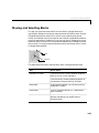
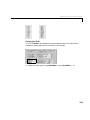
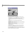
Moving and Selecting Blocks
The way you move and select blocks from the Dials & Gauges Blockset is
significantly different from how you move and select a Simulink block. Dials &
Gauges Blockset blocks consist of an “active” area containing the actual
control, and a border that surrounds that area. Dials & Gauges Blockset blocks
are active even when a simulation is not running; that is, dragging the cursor
anywhere within the control is interpreted as attempting to change the value
of the control. This figure shows the border and the active area within a Dials
& Gauges Blockset block.
Border
Active area
The table below tells how to manipulate a Dials & Gauges Blockset block.
Task
Mouse Action
Add block to model
From the Simulink Library Browser, drag the
block by its icon in the right pane.
From the library window (displaying blocks as
instruments), drag the block by its border.
Move block
Drag the block’s border. You can do this only if
the border is visible.
Select block
Click on the block’s border. Or “rubber-band
select” the block.
Resize block
Select the block, and then drag one of the
selection handles (as you would resize a
Simulink block).
1-11
1
Getting Started
Building a Simple Model
This section illustrates how to build and use a simple system, first using
Simulink blocks alone, and then using blocks from the Dials & Gauges
Blockset. By building the latter model, you can practice finding and using
blocks from the Dials & Gauges Blockset. By comparing the two models, you
can get a better sense of how graphical instruments might enhance the look,
feel, and usability of your own models. This section includes:
• “The Original Simulink Model”
• “Replacing Simulink Blocks with Instrumentation”
• “Building the Model” on page 1-13
The Original Simulink Model
Consider a system in which a Constant block feeds into a Gain block, while a
Scope block displays the output from the Gain block. All three of these blocks
are part of Simulink.
If you simulate this system and double-click on the Scope block, then the Scope
traces the value of its input signal over time. To change the value of the signal
that feeds into the Gain block, you double-click on the Constant block, type a
different number in the Constant value parameter field, and click on the OK
or Apply button in the dialog box.
Replacing Simulink Blocks with Instrumentation
Using the Dials & Gauges Blockset, you can replace the Constant and Scope
blocks from Simulink with instrument-like input and output. For example, a
Generic Knob block can provide variable input to the Gain block, which passes
its signal to a Lower Right display block.
1-12
Building a Simple Model
When you simulate this system, the Lower Right block displays the value of the
signal at that instant. To change the value of the signal that feeds into the Gain
block, you use your mouse to adjust the needle on the Generic Knob block.
Building the Model
To build the model described earlier, follow the steps below. Alternatively, type
dng_simple in MATLAB to open a completed copy of the model.
1 Open the Simulink Library Browser and create a new model window.
2 From the Simulink Math library, drag the Gain block into the model
window.
3 Double-click on the Gain block and change the Gain parameter to 4.
4 From the Knobs and Selectors library, drag the Generic Knob block into the
model. To do this, select Knobs and Selectors in the left pane of the Simulink
Library Browser, and then drag the Generic Knob block from the right pane
into the model.
5 From the Angular Gauges Library, drag the Lower Right block into the
model.
1-13
1
Getting Started
6 Draw connection lines from the Generic Knob block to the Gain block, and
from the Gain block to the Lower Right block.
7 From the model window’s Simulation menu, choose Simulation
parameters. Set the Stop time parameter to Inf.
Now you can run the model and watch how adjustments to the Generic Knob
block affect the needle on the Lower Right block.
1-14
Working with a Model
Working with a Model
This section indicates how you can perform common tasks involving the model
you built in the section “Building the Model” on page 1-13. This section
includes:
• “Running the Simulation”
• “Saving the Model”
• “Printing the Model” on page 1-16
Running the Simulation
Run the simulation by choosing Start from the model window’s Simulation
menu. While the simulation is running, you can manipulate the needle of the
Generic Knob block and observe results on the Lower Right gauge block. This
figure shows the model after the needle of the Generic Knob block is moved
from its default position.
To stop the simulation, choose Stop from the model window’s Simulation
menu.
Saving the Model
Save the model by choosing Save from the model window’s File menu. When
you save a model that contains blocks from the Dials & Gauges Blockset,
MATLAB automatically saves additional files that describe each Dials &
Gauges Blockset block. For example, if you save the model described in this
chapter with the name sample, then MATLAB saves the following files.
sample.mdl
sample@Generic_Knob.ax
sample@Lower_Right.ax
1-15
1
Getting Started
The files with the .ax extension describe the Dials & Gauges Blockset blocks.
Note that these files are not text files. They save the current state of the
ActiveX control that is embedded in the block. If you delete the .ax files, then
the corresponding blocks reinitialize themselves to the exact state in which
they are stored in the library.
Note The easiest way to rename a model is to open it in Simulink and use the
Save As menu option. If, alternatively, you simply rename the .mdl file from
your operating system, then remember to rename the associated .ax files.
Dials & Gauges Blockset Blocks Within Subsystems
If you save a model that contains a Dials & Gauges Blockset block within a
subsystem, then the subsystem’s name is also included in the name of the .ax
file. For example, if the model contains a Generic Knob block inside a
subsystem named SubSystem, then the following file is saved.
sample@SubSystem@Generic_Knob.ax
Printing the Model
You can print the structure of the model by choosing Print from the model
window’s File menu. However, the printing functionality in Simulink does not
print the active areas of Dials & Gauges Blockset blocks. Instead, it shows only
the outline of those blocks.
To capture the exact appearance of a model that contains Dials & Gauges
Blockset blocks, you can create a .bmp file that represents the model by
entering either of these commands in the MATLAB Command Window.
print -smodelname -dbitmap filename
print(['-s','modelname'],'-dbitmap','filename')
Here, modelname and filename list the names of the Simulink model and the
bitmap file, respectively. For example, if the open model is called sample, then
this command saves it in a file called samplepic.bmp.
print -ssample -dbitmap samplepic
After MATLAB creates the bitmap file, you can insert it into an application
that can print it.
1-16
Modifying Properties of Blocks
Modifying Properties of Blocks
This section describes how to view and modify properties of a preconfigured
Dials & Gauges Blockset block using a dialog box. This section includes:
• “Accessing the Properties”
• “Example Modifying Properties” on page 1-18
• “Learning More About Properties” on page 1-19
Accessing the Properties
You can view ActiveX control properties by using one of these procedures:
• Double-click on the active area of the block that contains the control.
• Right-click on the active area of the block and select the Control Display
Properties option.
This figure shows the context menu that appears when you right-click on the
Generic Knob block.
After selecting the Control Display Properties option, the ActiveX Control
Properties dialog box appears. This dialog box allows you to modify ActiveX
control properties. The next figure shows the dialog box for the Generic Knob
block.
1-17
1
Getting Started
If you modify any values in this dialog box, then the block is visually updated
immediately. However, the changes are not permanent until you choose OK or
Apply; if you choose Cancel, then the changes will be undone.
Example Modifying Properties
Returning to the model that you built in the section “Building a Simple Model”
on page 1-12, you can modify the range of possible input values by modifying
the properties of the Generic Knob block. For example, the instructions below
change the maximum knob value from 10 to 25 so that the maximum value on
the knob corresponds to the maximum value on the Lower Right gauge block.
1 Open the ActiveX Control Properties dialog box by double-clicking on the
active area of the Generic Knob block.
2 Display the panel that controls the scaling of values by clicking on the Scale
tab.
3 Set the Max parameter to 25.
4 Display the panel that controls tick marks by clicking on the Ticks tab.
5 Set the StopValue parameter to 25.
1-18
Modifying Properties of Blocks
6 Set the DeltaValue parameter to 5. This prevents the knob block from
looking too crowded.
The figure shows how the model looks as a result. Notice that the knob can now
register values between 0 and 25, and that it displays values in increments of 5.
Learning More About Properties
Dials & Gauges Blockset blocks have many properties. Changing the
appearance of a block might require changing several properties and can be
quite complex. “Modifying ActiveX Control Properties” on page 2-4 discusses
how to make some common changes, such as changing the range of values
displayed on a block.
For information about specific properties, consult the ActiveX control’s help by
double-clicking on the question-mark block that appears in each library of the
Dials & Gauges Blockset. Some libraries provide more than one question-mark
block, when the blocks contained in the library are significantly different from
each other. Once in the Help window, use the Properties link to display
information about block properties.
1-19
1
Getting Started
1-20
2
Using Instrumentation in
a Model
Connecting Blocks in a Model . . . . . . . . . . . . 2-3
Modifying ActiveX Control Properties
Using Multiple Styles Within One Block .
Understanding ID Properties . . . . . .
Displaying Text on a Block . . . . . . .
Controlling Values with the Mouse . . .
Modifying the Displayed Range . . . . .
Modifying Multiple Tick Marks . . . . .
.
.
.
.
.
.
.
.
.
.
.
.
.
.
.
.
.
.
.
.
.
.
.
.
.
.
.
.
.
.
.
.
.
.
.
.
.
.
.
.
.
.
.
.
.
.
.
.
.
.
.
.
.
.
.
.
2-4
2-4
2-7
2-8
2-10
2-12
2-15
Saving and Reusing a Customized Control . . . . . . 2-19
2
Using Instrumentation in a Model
This chapter describes how to use instrumentation in the Dials & Gauges
Blockset and includes these sections:
• “Connecting Blocks in a Model” on page 2-3 describes how to determine
which type(s) of connections a block can have.
• “Modifying ActiveX Control Properties” on page 2-4 shows how to change
various properties of a block using the ActiveX Control Properties dialog
box.
• “Saving and Reusing a Customized Control” on page 2-19 describes how to
store your customized block properties for later use or to share with other
users.
2-2
Connecting Blocks in a Model
Connecting Blocks in a Model
Before you connect a Dials & Gauges Blockset block with other blocks, you
should know whether it is meant to be an input device (with an output
connection), or an output device (with an input connection). Dials & Gauges
Blockset blocks are initially drawn with both an inport and an outport, but
Simulink removes unused ports when the simulation starts running or when
you update the block diagram.
To determine whether a Dials & Gauges Blockset block is meant to be used as
an input or output device, right-click on the block and select the Block
Parameters option.
Note If you built your own ActiveX control by customizing the generic
ActiveX Control block, then another way to display the custom block’s Block
Parameters dialog box is to double-click on the border of the block.
In the Block Parameters dialog box, the Connections field determines the
type of connection the block currently uses:
• Input indicates that the block has an inport and receives a signal. The Input
property parameter indicates the block’s property whose value is changed
by the input.
• Output indicates that the block has an outport and outputs a signal. The
Output property parameter indicates the block’s property whose value is
output.
• Both indicates that the block has an inport and an outport and receives and
outputs a signal.
• Neither indicates that the block has neither an inport nor an outport.
To specify a connection different from the block’s default setup, choose the
Connection type and make sure that the Input property and Output
property fields are filled in with the appropriate property name. See
“Summary of Dialog Box Fields and Check Boxes” on page 3-29 for information
about the other fields and check boxes. You can also press the Help button to
find out about other parameters.
2-3
2
Using Instrumentation in a Model
Modifying ActiveX Control Properties
You can modify many properties of a preconfigured Dials & Gauges Blockset
block using its ActiveX Control Properties dialog box, introduced in
“Accessing the Properties” on page 1-17. Modifying some properties is
straightforward. This section discusses some of the more complicated tasks and
concepts, in these subsections:
• “Using Multiple Styles Within One Block”
• “Understanding ID Properties” on page 2-7
• “Displaying Text on a Block” on page 2-8
• “Controlling Values with the Mouse” on page 2-10
• “Modifying the Displayed Range” on page 2-12
• “Modifying Multiple Tick Marks” on page 2-15
For more information about individual properties of the preconfigured blocks,
see the online help for the corresponding ActiveX controls. To access such help,
open the library window and double-click on the question-mark block. The
online help summarizes the functionality and contains links to information
about properties, events, and methods.
Using Multiple Styles Within One Block
Some ActiveX control properties let you use more than one style for a given
component or characteristic, in the same block. For example, you might use
multiple styles to create:
• Different font characteristics for text in different places
• Multiple colors within a graphical element such as an annular region or a
divided pie chart
• Multiple sets of ticks, each with its own size or labeling characteristics
• Multiple components, such as LEDs or needles, each with its own
characteristics
Many Dials & Gauges blocks include multiple styles by default:
• The Vacuum block in the Angular Gauges library uses three text styles: one
for the tick labels, one for the number at the bottom of the gauge, and one for
the text near the center of the gauge.
2-4
Modifying ActiveX Control Properties
• The Volume block in the Angular Gauges library uses three adjacent annular
regions, each with a different color.
• The Thermometer block in the Sliders library uses two styles for ticks: one
for numbered ticks every 10 degrees and another for unnumbered ticks every
2 degrees.
• The Circle Meter block in the LEDs library applies one of three LED styles
to each of 10 LEDs. The three styles differ in their colors.
Determining When Multiple Styles Are Allowed
To find out whether a component supports multiple styles, look in the block’s
property dialog box for a pair of properties whose names are like this,
respectively:
• A plural noun describing the component, such as Fonts or Scales
• A word that combines the noun and the letters ID, such as FontID or
ScaleID
As an example, the figure below shows the pair of properties, Fonts and
FontID, that indicate the ability to create multiple font styles.
If the dialog box has no such properties for the component you are interested
in, then you cannot create multiple styles for that component. For example, in
the Background panel of a block’s dialog box, you can define the color of an
outline, but you cannot create multiple concentric outlines of different colors.
Creating Styles
After locating the style-identifying pair of properties for the component you are
interested in, follow these steps to create an additional style:
2-5
2
Using Instrumentation in a Model
1 Click on the up arrow next to the value of the first property in the pair
(Fonts in the figure). This value is the number of defined styles. If N styles
are defined, then each is associated with an integer between 0 and N-1. The
corresponding ID property (FontID in the figure) can assume values
between 0 and N-1.
2 Click repeatedly on the up arrow next to the ID property to set it to its
maximum value. This causes the dialog box panel to reflect the attributes of
that particular style instead of the other defined styles.
3 Configure other properties in the dialog box panel to match the attributes
that you want that particular style to have. In the figure, the Set Font
button allows you to set font attributes and the Sample box displays text
using those attributes. In many cases, all properties in the panel except the
original style-identifying pair are attributes of the style. In a few cases, only
part of the panel contains attributes of the style and others are global
attributes that apply to all styles.
To view attributes of an existing style, set the ID property to the integer
associated with that style. Then, properties other than the style-identifying
pair reflect attributes of that style.
Applying Styles
In some cases, creating a style implicitly causes the block to apply it in a
straightforward way. For example, creating an additional style for tick marks
automatically creates an additional set of tick marks on the block. In other
cases, creating a style does not implicitly cause the block to apply it. For
example, even after you create an additional font style, you will not see its
effect on the block until you indicate which text should use that style. This
section describes how to apply styles that the block does not apply immediately
after you create them.
To determine where you can apply a style you have created, look for the
corresponding ID property on a panel of the dialog box other than the panel
where you defined the style. For example, the figure below shows part of a
Captions panel containing the FontID property. The fact that the FontID
property is not preceded by a Fonts property indicates that this is a panel that
allows you to apply font styles but not define them.
2-6
Modifying ActiveX Control Properties
Once you have located a part of the dialog box where you can apply a style you
previously created, simply set the ID property to match the ID property of that
style. For example, the figure above shows that the block has exactly one
caption, and that the caption’s font style is the one whose ID is 1. If you change
the FontID property in the Captions panel to a different number, then you will
probably notice a change in some text on the block.
Understanding ID Properties
Many blocks have properties whose names end with ID, such as FontID,
ScaleID, and NeedleID. Such properties allow you to use more than one style
in the same block, as in the situations listed in “Using Multiple Styles Within
One Block” on page 2-4. This section describes how to interpret ID property
settings. For an example that examines ID property settings among a block’s
default settings, see “Modifying Multiple Tick Marks” on page 2-15.
The value of an ID property refers to a style by number. To determine the
purpose of the ID property, first see whether the property directly above it is a
plural noun similar to the ID property’s name. (For example, see whether the
property directly above FontID is Fonts.) Then:
• If the property directly above the ID property is a plural noun similar to the
ID property’s name, then this panel of the dialog box defines a set of styles.
The ID property associates a number with each style. Other properties in the
dialog box panel reflect the definition of the style whose number is the
current value of the ID property. By varying the value of the ID property, you
can view the definition of a different style.
For example, in the Fonts panel of the Volume block, the FontID property
occurs directly underneath a Fonts property. This panel of the dialog box
defines font styles, and the Sample box displays text using the font style
whose number is the current value of the FontID property.
2-7
2
Using Instrumentation in a Model
Caution If you decrease the value of the property named by the plural noun
(for example, the Fonts property), then the style corresponding to the highest
ID value is removed. To replace that style, you have to add a new style and
recreate the settings of the deleted style from the default settings.
• If the property directly above the ID property is not a plural noun similar to
the ID property’s name, then the ID property applies a style that was
previously defined in another panel of the dialog box. Other properties in the
dialog box panel indicate the context in which the style is applied. By varying
the value of the ID property, you can select a different style to apply.
For example, in the Captions panel of the Volume block, the FontID
property does not occur directly underneath a Fonts property. The purpose
of the FontID property in this case is to reference previously defined font
styles and apply them to captions. The font styles are defined on the Fonts
panel of the dialog box.
Sometimes, multiple styles are combined so seamlessly that it is not obvious
why multiple styles are needed or which parts of the block correspond to which
style definitions. You can often adjust the definition of the style to make the
style usage more apparent. For example, if you change the colors of different
annular regions and then look for the corresponding change in the block, then
you should be able to figure out how the design is split among multiple annular
regions.
Displaying Text on a Block
Many blocks allow you to include text on the block. Such text might describe
the quantity being measured, the units of measurement, or other information.
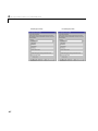
The table below lists some types of text that are associated with a specific part
2-8
Modifying ActiveX Control Properties
of the block, as well as the part of the ActiveX Control Properties dialog box
panel that defines the text. Some types of text apply only to certain blocks.
Type of Text
Part of Dialog Box That Defines or Enables Text
Title appearing in
block’s outline
Title property on Background panel
Numerical labels near
tick marks
Labels area on Ticks panel. On Strip Chart
block, Labels properties on Tracks and X Axis
panels.
Numerical labels near
pointer, needle, or knob
Digital panel
Captions appearing
anywhere on block
Captions panel
Using the Captions Panel to Display Text
When it is present, the Captions panel of the ActiveX Control Properties
dialog box allows you to place text anywhere on the block. Blocks that use text
captions by default include: Mixer Scale, Tank, Thermometer, Amp Meter, and
Volume. This section describes how to add, remove, and change characteristics
of text captions using the Captions panel.
Adding and Removing Text Captions. To create a new text caption, follow these
steps:
1 Increase the value of the Captions property by one.
2 Set CaptionID to its maximum value. This is the index that corresponds to
the newest text caption.
3 Type the desired text in the Caption edit field.
To remove the most recently added text caption, decrease the value of the
Captions property by one. Note that this removes all characteristics of that
text caption.
2-9
2
Using Instrumentation in a Model
Changing Fonts and Other Characteristics of Text Captions. To change the font of an
existing text caption, you must create a numbered font style and then apply
that style to the caption. Follow these steps:
1 Open the Fonts panel of the dialog box.
2 Allocate space for a new font style by increasing the value of the Fonts
property by one.
3 Set FontID to its maximum value. This is the index that corresponds to the
newest font style.
4 Press the Set Font button and select font characteristics.
5 Open the Captions panel of the dialog box.
6 Set CaptionID to the index that corresponds to the text caption whose font
you want to change.
7 Apply the font style to the caption by setting FontID to the font style’s index.
To change other characteristics of an existing text caption, first set the
CaptionID property on the Captions panel to the value that corresponds to the
text caption you want to change. Then use other properties on the dialog box
panel, except the Captions counter, to configure the text caption accordingly.
Note For text captions, the color choice on the Captions dialog box panel
overrides the color choice on the Fonts dialog box panel.
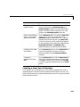
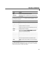
Controlling Values with the Mouse
A key benefit of using a source block, such as a knob or slider, from the Dials &
Gauges Blockset is the ability to adjust the value of the control by clicking or
dragging the mouse over the control. Except for toggle elements, most
mouse-controllable values in this blockset offer three modes of mouse response:
None, Relative, and Snap To. This section describes the mouse-reponse modes
and explains how to choose a mouse-response mode.
2-10
Modifying ActiveX Control Properties
Description of Mouse-Response Modes
The table below describes how a control’s value responds to mouse events
under different mouse-response modes.
Mode
Behavior
None
The control’s value does not respond to mouse
events.
Relative
The change in the control’s value depends on
the change in the mouse position when the
mouse pointer is dragged.
Snap To
The control’s value becomes that of the current
mouse position when the mouse button is
released.
Note Some mouse-controllable blocks do not offer these options. Blocks in the
Buttons & Switches library always respond to mouse clicks. If the Odometer
block has a reset button, then it always responds to mouse clicks.
For example, if a vertical slider block uses the Snap To mode, then you can set
the block’s value to 12 by clicking on the value 12 on the block. If the same block
uses the Relative mode and has a current value of 20, then you can set the
block’s value to 12 by dragging the mouse pointer downward until the slider
knob corresponds to 12. When you drag, the mouse pointer must be within the
bounds of the slider control, but does not need to be on or near the value 12.
Choosing a Mouse-Response Mode
The mouse-response modes described above correspond to settings of the
MouseControl property in a block’s ActiveX Control Properties dialog box.
2-11
2
Using Instrumentation in a Model
The table below indicates which categories of blocks and which dialog box
panels have a MouseControl property.
Category of Block
Panel in Dialog Box
Angular Gauges
Needles
Knobs & Selectors
Knob
Linear Gauges
Pointers
Percent Indicators
Portions
Sliders
Knob
In typical Simulink models, blocks acting as sources use the Relative or Snap
To mode to enable mouse control, while blocks acting as sinks use the None
mode to disable mouse control.
Modifying the Displayed Range
Changing the range of values displayed on a block involves adjusting these
properties:
• Scale properties define the extent of the units displayed by the block, the
location of the block’s center, and the block’s start and stop positions.
• Tick mark properties define tick marks on the block, including start and stop
values, the interval between tick marks, and label positions.
• Needle or pointer properties indicate the value.
To illustrate how to use these properties to adjust the range of values displayed
on a block, this example changes the Generic Linear Gauge to display values
from -20 to 20, sets the interval between tick marks to 5, and shows the tick
mark labels. This figure shows the Generic Linear Gauge with its default
settings (left) and with modified settings (right).
2-12
Modifying ActiveX Control Properties
Changing the Scale
Click on the Scales tab to display the scales properties page. This figure shows
the default scale properties for the Generic Linear Gauge.
To modify the scale range, change ScaleMax to 20 and ScaleMin to -20.
2-13
2
Using Instrumentation in a Model
Displaying Labels Next to Tick Marks
Click on the Ticks tab to display the tick mark properties page. This figure
shows the default tick mark properties.
To show tick mark labels, check the Label On/Off check box.
To set the starting and ending tick marks so they mark the minimum and
maximum scale settings, set StartValue to -20 and StopValue to 20. Change
the DeltaValue property, which sets the spacing between tick marks. A value
of 5 is reasonable for default block size.
Setting the Current Pointer Value
Click on the Pointers tab to display the pointer properties page. This figure
shows the default pointer properties.
.
2-14
Modifying ActiveX Control Properties
The Value property indicates the current pointer value. Set the initial value to
0, halfway between the maximum and minimum scale values. Click on OK to
accept the changes and close the dialog box.
Modifying Multiple Tick Marks
Some characteristics can be repeated in a block. For example, a single block can
display multiple needles or tick marks. This example illustrates the use of
multiple tick marks and the use of the ID property to manage them. This
example, instead of modifying a block, examines the default settings for a
particular block.
Note This release of the Dials & Gauges Blockset does not support the use of
multiple needles or pointers to display more than one value. Passing a vector
signal to a Dials & Gauges Blockset block displays only the first element of the
vector. The Strip Chart block, however, is an exception to this because it does
support vector input.
This figure shows the Amp Meter block. Notice that the tick marks have two
different lengths. These are created by defining two sets of tick marks.
The first set consists of 11 longer tick marks, each positioned at one of the label
values, positioned at increments of 1.0. The second set consists of five shorter
tick marks for each integer change in the scale, positioned at increments of 0.2.
To examine how these tick marks have been created, double-click on the Amp
Meter block to display its properties dialog box. Select the Ticks tab.
2-15
2
Using Instrumentation in a Model
5
1
4
2
3
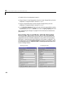
The Ticks and TickID properties, in the box labeled 1, are defined as follows:
• The Ticks property specifies how many sets of tick marks are used by the
block. For this block, this property is set to 2.
• The TickID property indicates which set of tick marks is defined by the other
properties on this page. When specifying the characteristics of a set of tick
marks, you set the TickID property, and then define the property values for
that set of tick marks. In the dialog box page above, the settings for all the
properties on the page apply to the first set, identified as TickID 0.
Note When defining multiple components, the first instance is identified by
an ID of 0. In this example, the two sets of tick marks have IDs of 0 and 1.
2-16
Modifying ActiveX Control Properties
The Position/Size properties, in the box labeled 2, are defined as follows:
• The Inner property defines the edge of the tick mark closest to the needle
center and the Outer property defines the edge of the tick mark farthest
from the needle center. To see where the tick marks are located relative to
the needle length, examine the needle length by selecting the Needles page.
The needle length is 2.0. The Inner position is 1.70 and the Outer position
is 2.00. These tick marks are 0.3 units long.
• The Width property of the tick marks is 0.00, the narrowest width.
The Range properties, in the box labeled 3, are defined as follows:
• StartValue determines at which scale value the first tick mark is displayed.
For these tick marks, the value is 0.
• StopValue determines at which scale value the last tick mark is displayed.
For these tick marks, the value is 10.
• DeltaValue determines the interval between tick marks. For these tick
marks, the value is 1.
The Labels properties On/Off check box, in the box labeled 4, determines
whether the labels are displayed. For the first set of tick marks, the labels are
displayed.
The FontID property, in the box labeled 5, determines which of multiple fonts
defined for this block is used for the label. In this case, two font sets are defined.
The first (FontID 0) is for the tick marks, while the second (FontID 1) is for the
caption, “Amps.”
To examine the second set of tick marks, change the TickID property value to
1 by clicking on the up arrow to the left of the value. The Ticks page looks like
this.
2-17
2
Using Instrumentation in a Model
1
4
2
3
The Position/Size properties, in the box labeled 2, are defined as follows:
• The Inner position is 1.90 and the Outer position is 2.00. These tick marks
are 0.10 units long, one-third the length of the longer tick marks.
• The Width property of the tick marks is 0.00, the same as the longer tick
marks.
The Range properties, in the box labeled 3, are defined as follows.
• StartValue for these tick marks is 0. The first short tick mark and the first
long tick mark appear in the same place.
• StopValue for these tick marks is 10. The last short tick mark and the last
long tick mark appear in the same place.
• DeltaValue determines the interval between tick marks. For these tick
marks, the value is 0.2.
The Labels properties On/Off check box determines whether labels appear
next to the tick marks. No labels appear next to this set of tick marks.
If you decrease the Ticks property, then the tick mark settings corresponding
to the highest TickID value is removed. To replace that set of tick marks, you
will have to recreate the settings from the defaults.
2-18
Saving and Reusing a Customized Control
Saving and Reusing a Customized Control
If you have modified settings in a block’s ActiveX Control Properties dialog
box, then you might want to store the customized version of the block for later
use or to share with other users. The following subsections describe two
methods:
• “Saving Customized Controls Automatically” (easier)
• “Saving Customized Controls Using the Library Panel”
Saving Customized Controls Automatically
Simply saving the model causes MATLAB to save all property settings for Dials
& Gauges Blockset blocks in .ax files (See “Saving the Model” on page 1-15.).
To share your customized controls with other users, give them the .mdl file
along with all of its associated .ax files. To use your customized block in a new
model, copy the block from the old model to the new model, and then save the
new model.
Saving Customized Controls Using the Library Panel
Alternatively, you can use the ActiveX Control Properties dialog box to save
property settings for later use on your own machine. However, this method
does not enable you to share these customized controls with users of other
machines. The steps are:
1 Select the Library tab of the ActiveX Control Properties dialog box.
2 Assign a name to the collection of modified settings by entering a new name
in the Configuration Name field.
Note If you leave this field blank, the new property settings write over the
previous settings, which means that you cannot access the original version
except by reinstalling the blockset or by registering the ActiveX controls
again. To learn how to register the ActiveX controls, see “Configuring the
Dials & Gauges Blockset” on page 1-9.
3 To provide textual information about the block, click on Notes. This dialog
box appears, filled in with sample text.
2-19
2
Using Instrumentation in a Model
4 Enter a description in the text area and click on OK.
5 Select the directory in which to store the modified control by expanding the
library hierarchy at the left. The new set of property settings is stored in the
directory you select. Click on Store.
6 Click on OK to accept all the changes and close the dialog box.
2-20
Saving and Reusing a Customized Control
The figure below shows the dialog box with fields filled in. The customized
control is stored in the Linear Gauge directory.
An alternative to this procedure is to export customized controls to .gms files.
To do this, select a directory from the left side of the panel and click on Export.
You can later access these controls by using the Import button, or share the
controls by sharing the .gms files.
2-21
2
Using Instrumentation in a Model
2-22
3
Categories of ActiveX
Controls
Angular Gauges
. . . . . . . . . . . . . . . . . . 3-3
Buttons & Switches . . . . . . . . . . . . . . . . . 3-6
Knobs & Selectors
LEDs
. . . . . . . . . . . . . . . . . 3-8
. . . . . . . . . . . . . . . . . . . . . . . 3-14
Linear Gauges . . . . . . . . . . . . . . . . . . . 3-16
Numeric Displays
. . . . . . . . . . . . . . . . . 3-19
Percent Indicators . . . . . . . . . . . . . . . . . 3-21
Sliders
. . . . . . . . . . . . . . . . . . . . . . 3-24
Strip Chart
. . . . . . . . . . . . . . . . . . . . 3-27
Using Your Own ActiveX Control
. . . . . . . . . . 3-28
3
Categories of ActiveX Controls
This chapter discusses various categories of instrumentation that you can use
in your model. Each of the sections listed below corresponds to a library within
the Dials & Gauges Blockset:
• “Angular Gauges” on page 3-3
• “Buttons & Switches” on page 3-6
• “Knobs & Selectors” on page 3-8
• “LEDs” on page 3-14
• “Linear Gauges” on page 3-16
• “Numeric Displays” on page 3-19
• “Percent Indicators” on page 3-21
• “Sliders” on page 3-24
• “Strip Chart” on page 3-27
Also, “Using Your Own ActiveX Control” on page 3-28 describes how to
incorporate ActiveX controls into your model if they are not part of the
standard Dials & Gauges Blockset package.
3-2
Angular Gauges
Angular Gauges
The Angular Gauges library contains controls that reflect their input value
graphically along an arc of a circle. Blocks in the library differ from each other
in their numerical ranges and in their use of needles, numerical labels, text
captions, annular components, and tick marks.
The next section describes how to customize angular gauges by making
changes that are specific to the Angular Gauges library. For changes that apply
to multiple categories of blocks, see these sections:
• “Using Multiple Styles Within One Block” on page 2-4
• “Displaying Text on a Block” on page 2-8
• “Modifying the Displayed Range” on page 2-12
• “Modifying Multiple Tick Marks” on page 2-15
Customizing Angular Gauges
The table below lists some common customizations involving the ActiveX
Control Properties dialog box that are specific to blocks in the Angular
Gauges library.
Task
Description
Change the shape or
size of a needle
On the Needles panel, set NeedleID to the ID of
the needle you want to change (0 if there is
exactly one needle). Then use the Style property
to choose the shape, and the Length and Width
properties to determine the length and thickness.
Label a needle by
displaying the
corresponding
number
On the Digital panel, set NeedleID to the ID of
the needle you want to label and check the
Enabled check box.
3-3
3
Categories of ActiveX Controls
Task (Continued)
Description (Continued)
Change the
appearance of a
needle label
On the Digital panel, first set NeedleID to the ID
of the needle whose label you want to change.
Then use Decimals to set the number of digits
after the decimal point, Color to set the color of
the number, and FontID to refer to a previously
defined font (on the Fonts panel).
Move a needle label
On the Digital panel, first set NeedleID to the ID
of the needle whose label you want to change.
Then use X Position and Y Position to set the
fixed position for the label.
Draw an annular
region along the scale
On the Annulars panel, increase the value of the
Annulars property. The ID of the new region is
the Annulars property value minus one. To
specify properties of the new region, see the next
task.
Change the
appearance of an
annular region
On the Annulars panel, first set AnnularID to
the ID of the annular region you want to change.
Use the Radius properties to control the annular
region’s thickness and radial position. Use the
Value properties to control the portion of the
scale’s range that the annular region includes.
Use Color to control the annular region’s color.
Delete the most
recently added
annular region
On the Annulars panel, decrease the Annulars
property. This deletes all properties associated
with the region, such as its color and thickness.
Combining Multiple Needles in One Display
If you want to display multiple needles on a single block, then the
customizations in the table below might be relevant. Note that the Simulink
3-4
Angular Gauges
input signal controls only one needle’s value. Unless you access the control
directly as an ActiveX object, the remaining needles have static values.
Task
Description
Add another needle to
the display
On the Needles panel, increase the Needles
property. The ID of the new region is the Needles
property value minus one. To specify properties of
the new needle, set NeedleID to that ID and then
set the remaining properties on the dialog box
panel accordingly.
Delete the most
recently added needle
from the display
On the Needles panel, decrease the Needles
property. This deletes all properties associated
with the needle, such as its color and shape.
3-5
3
Categories of ActiveX Controls
Buttons & Switches
The Buttons & Switches library contains two-state controls that change their
state when you click on them. The block output is 0 when the block’s state is
“off” and -1 when the state is “on.” The blocks in this library differ in cosmetic
ways, such as the image(s) shown on the block and the changes in the block’s
appearance after you click on it. The next sections describe how to customize
buttons and switches, and how to change the output values from buttons and
switches.
Customizing Buttons and Switches
The table below lists some common ways to customize a block in the Buttons &
Switches library, using its ActiveX Control Properties dialog box.
3-6
Task
Description
Associate an image
with a state
Press the Picture button on the On or Off panel,
and select a graphics file. You cannot associate
both an image and text with a state.
Associate text with a
state
Use the Caption field on the On or Off panel. The
X and Y values control the position of the text.
The BackColor and ForeColor buttons control
the colors of the background and text,
respectively. You cannot associate both an image
and text with a state.
Associate a sound
with a state
On the On or Off panel, check the Sound check
box and list a .wav file in the Wave file field. You
can either type the name of the sound file or
browse for it using the ... button.
Make the button turn
off after being on for a
specified length of
time
Set the OnTimer property in the General panel
to a nonzero value, measured in milliseconds.
Buttons & Switches
Task (Continued)
Description (Continued)
Use beveling to make
the button appear
three-dimensional
Use the BevelInner and BevelOuter properties
on the Background panel.
Change the way the
button’s beveling (if
visible) responds to a
mouse click
Use the Mode property on the General panel.
Under the SingleState option, the bevels remain
fixed. Under the TwoState option, the bevels
toggle with each mouse click. Under the Pressed
option, the bevels toggle only while you are
pressing the mouse button.
Changing Output Values
Blocks in this library output the values -1and 0. To convert these output values
to conventional Simulink true and false values, multiply the output signal by
-1. A block to accomplish this is in the Buttons & Switches library. To perform
other numerical mappings, send the output to a Look-Up Table block in
Simulink.
3-7
3
Categories of ActiveX Controls
Knobs & Selectors
The Knobs & Selectors library contains two dial blocks that you can control
using the mouse:
• The Generic Knob block assumes values in a continuum by default. You can
also configure it to assume discrete values along a linear scale. For common
customizations specific to this block, see “Customizing the Generic Knob
Block” on page 3-9.
• The Frequency Selector block assumes only values in a discrete set. The
discrete set can be labeled with alphanumeric captions of your choice, but the
block’s output values are nonnegative integers. For common customizations
specific to this block, see these sections:
- “Customizing the Frequency Selector Block” on page 3-10
- “Creating a New Set of Selections” on page 3-11
- “Changing Output Values” on page 3-13
For changes that apply to Knobs & Selectors blocks, as well as other categories
of blocks in this blockset, see these sections:
• “Using Multiple Styles Within One Block” on page 2-4
• “Displaying Text on a Block” on page 2-8
• “Modifying the Displayed Range” on page 2-12
• “Modifying Multiple Tick Marks” on page 2-15
3-8
Knobs & Selectors
Customizing the Generic Knob Block
The table below lists some common customizations involving the ActiveX
Control Properties dialog box of the Generic Knob block.
Task
Description
Change the shape or
size of the selector
knob
On the Knobs panel, use the KnobStyle property
to choose the shape, and the KnobRadius
property to determine the size.
Display a mark on the
knob to indicate the
selected position more
precisely
On the Mark panel, choose a value for MarkStyle
other than None. To customize the appearance of
the mark, use the other properties on the Mark
panel.
Remove the mark
from the knob
On the Mark panel, set MarkStyle to None.
Determine whether
the knob can select
from a continuous or
discrete range
On the Knobs panel, check the KnobSnap check
box to restrict the knob to discrete values. In this
case, KnobSnapIncrement is the distance
between successive discrete values. Uncheck the
KnobSnap check box to allow the knob to assume
all values in the range.
Label the selector
knob by displaying
the corresponding
number
On the Digital panel, check the Digital check
box.
Change the
appearance of the
selector knob label
On the Digital panel, use DigitalDecimals to set
the number of digits after the decimal point,
DigitalColor to set the color of the number, and
DigitalFontID to refer to a previously defined
font (on the Fonts panel).
Move the selector
knob label
On the Digital panel, use DigitalX and DigitalY
to set the fixed position for the label.
3-9
3
Categories of ActiveX Controls
Task (Continued)
Description (Continued)
Draw an annular
region along the scale
On the Annulars panel, increase the value of the
Annulars property. The ID of the new region is
the Annulars property value minus one. To
specify properties of the new region, see the next
task.
Change the
appearance of an
annular region
On the Annulars panel, first set AnnularID to
the ID of the annular region you want to change.
Use the Radius properties to control the annular
region’s thickness and radial position. Use the
Value properties to control the portion of the
scale’s range that the annular region includes.
Use Color to control the annular region’s color.
Delete the most
recently added
annular region
On the Annulars panel, decrease the Annulars
property. This deletes all properties associated
with the region, such as its color and thickness.
Customizing the Frequency Selector Block
The table below lists some simple customizations involving the ActiveX
Control Properties dialog box of the Frequency Selector block. To learn how
to create an entirely new discrete set of selections, see “Creating a New Set of
Selections” on page 3-11.
3-10
Task
Description
Change the shape or
size of the selector
knob
On the Knobs panel, use the KnobStyle property
to choose the shape, and the KnobRadius
property to determine the size.
Display a mark on the
knob to indicate the
selected position more
precisely
On the Mark panel, choose a value for MarkStyle
other than None. To customize the appearance of
the mark, use the other properties on the Mark
panel.
Remove the mark
from the knob
On the Mark panel, set MarkStyle to None.
Knobs & Selectors
Task (Continued)
Description (Continued)
Change the dial’s
range of motion
On the Auto panel, check the AutoAngleConfine
check box and then use AutoStartAngle and
AutoStopAngle to define the range of allowable
angles. To allow the dial to move in a full circle,
uncheck the AutoAngleConfine check box.
Define a new selection
(that is, new possible
value for the knob)
On the Selections panel, increase the Selections
property. The ID of the new selection is the
Selections property value minus one. To specify
properties of the new selection, set SelectionID
to that ID and then set the remaining properties
on the dialog box panel accordingly. Note that the
Highlight Selection and Highlight Color
properties apply to all selections on the block.
Change the text label
of a selection
On the Selections panel, first set SelectionID to
the ID of the selection you want to change.
Specify the label using the SelectionCaption
property.
Change the
appearance of a text
label
On the Selections panel, first set SelectionID to
the ID of the selection you want to change. Then
use Color to set the color of the text, and FontID
to refer to a previously defined font (on the Fonts
panel).
Creating a New Set of Selections
If you want to vary the selections on the Frequency Selector block, then it
might be easier to remove the existing selections and create a new set. This
section illustrates how to create a customized version of the Frequency Selector
block that looks like this:
3-11
3
Categories of ActiveX Controls
1 Copy the Frequency Selector block from the library into a new model.
2 From the model window, open the block’s ActiveX Control Properties
dialog box. All other steps in this procedure refer to this dialog box.
3 Set up the block to configure selections and their captions automatically, by
checking all of the check boxes on the Auto panel and setting
AutoOffsetStyle to Vertical. The automatic configurations are a good
starting point, from which you can make manual adjustments later.
4 Define the dial’s range of motion by setting AutoStartAngle to 225 and
AutoStopAngle to 135. These numbers represent degrees, starting from the
top of the block and moving clockwise.
5 Remove all but one of the existing selections by setting the Selections
property on the Selections panel to 1.
6 Adjust the remaining selection by setting SelectionCaption to Eighth Rate
and setting Color to black.
7 Add three additional selections by setting the Selections property to 4.
8 Configure the additional selections one at a time. For each selection, first set
SelectionID, and then change SelectionCaption according to the table
below.
3-12
SelectionID
SelectionCaption
0
Eighth Rate
1
Quarter Rate
Knobs & Selectors
SelectionID
SelectionCaption
2
Half Rate
3
Full Rate
9 Change the color of the currently chosen value to red by setting
HighlightColor to red.
Manually Adjusting the Selections
It is generally easier to let the block determine the positions of selections and
their captions. However, you can also adjust the positions manually by using
one or more of these techniques:
• To vary the horizontal justification of a selection caption, first uncheck the
AutoAlign check box on the Auto panel. Then, on the Selections panel, set
SelectionID to the ID of the selection you want to change and vary the
SelectionAlign property.
• To vary the positions of the selection captions, first uncheck the AutoAlign
and AutoOffset check boxes on the Auto panel, in that order. Then, on the
Selections panel, set SelectionID to the ID of the selection you want to
change and vary the SelectionOffsetX, SelectionOffsetY, and
SelectionRadius properties.
• To vary the angles of a selection, first uncheck the AutoAngle check box on
the Auto panel. Then, on the Selections panel, set SelectionID to the ID of
the selection you want to change and vary the SelectionAngle property.
Changing Output Values
The Frequency Selector block outputs the SelectionID property of the selection
to which the knob points. These values are integers between 0 and one less
than the value of the Selections property.
To convert the output values to a base-10 logarithmic scale, you can send the
output to the block called Freq. Selector convert to Simulink, located in the
Knobs & Selectors library. To convert these output values to an arbitrary set of
numbers that might be useful for your application, you can send the output to
a Look-Up Table block in Simulink.
3-13
3
Categories of ActiveX Controls
LEDs
The LEDs library contains controls that use graphical elements to imitate
light-emitting diodes (LEDs). Each block reflects its input value by setting one
or more graphical elements to an “on” or “off” state. By default, the number of
LEDs in the “on” state is the rounded value of the block’s input.
Most blocks in this library contain a single LED. These blocks differ from each
other in the appearance of their LED. The Vertical Meter, Horizontal Meter,
and Circle Meter blocks contain multiple LEDs per block. The next section
describes how to customize LEDs.
Customizing LEDs
The table below lists some common ways to customize a block in the LEDs
library, using its ActiveX Control Properties dialog box.
3-14
Task
Description
Add or remove LEDs
Change the NumLEDs property on the
LEDs/General panel.
Change the shape or
color of a particular
LED
On the LEDs/General panel, set LEDIndex to
the number corresponding to the LED you want
to customize. To apply a previously defined style,
set the LEDStyleID to the number corresponding
to the style. To define a new style for this LED,
increase the StyleID property on the Styles panel
and then configure the color, picture, or shape
properties accordingly.
Change the size or
layout of a set of
LEDs
On the LEDs/General panel, use LEDWidth and
LEDHeight to control the size of each LED. Use
LEDSeparation to control the spacing between
successive LEDs. Use Orientation and/or
Direction to control how multiple LEDs are
arranged along a line.
LEDs
Task (Continued)
Description (Continued)
Display a binary
representation of the
(rounded) input
Set the Mode property on the LEDs/General
panel to Bitwise. The first LED corresponds to
the least significant bit.
Display decaying
maximum value of the
input, in addition to
the current input
Check the MaxDecay check box on the
LEDs/General panel. The DecayRate value
controls how quickly the displayed value decays
from the maximum to the current input value.
Larger positive values correspond to a slower
decay. A value of zero causes the block to reflect
its maximum value with no decay.
3-15
3
Categories of ActiveX Controls
Linear Gauges
The Linear Gauges library contains controls that reflect their input value
graphically along a linear scale. Blocks in the library differ from each other in
their numerical ranges and in their use of pointers, numerical labels, text
captions, and tick marks.
The next section describes how to customize linear gauges by making changes
that are specific to the Linear Gauges library. For changes that apply to
multiple categories of blocks, see these sections:
• “Using Multiple Styles Within One Block” on page 2-4
• “Displaying Text on a Block” on page 2-8
• “Modifying the Displayed Range” on page 2-12
• “Modifying Multiple Tick Marks” on page 2-15
3-16
Linear Gauges
Customizing Linear Gauges
The table below lists some common customizations involving the ActiveX
Control Properties dialog box that are specific to blocks in the Linear Gauges
library.
Task
Description
Change the shape or
size of a pointer
On the Pointers panel, set PointerID to the ID of
the pointer you want to change (0 if there is
exactly one pointer). Then use the Style property
to choose the shape, the Inner and Outer
properties to determine the length, and the
Width property to determine the thickness.
Label a pointer by
displaying the
corresponding
number
On the Digital panel, set PointerID to the ID of
the pointer you want to label and check the
PointerDigital check box.
Change the
appearance of a
pointer label
On the Digital panel, first set PointerID to the
ID of the pointer whose label you want to change.
Then use Decimals to set the number of digits
after the decimal point, PointerDigitalColor to
set the color of the number, and FontID to refer
to a previously defined font (on the Fonts panel).
Move a pointer label
to a fixed position
On the Digital panel, first set PointerID to the
ID of the pointer whose label you want to change.
Uncheck the PointerDigitalAttach check box
and use PointerDigitalX and PointerDigitalY to
set the fixed position for the label.
Move a pointer label
to a position relative
to the pointer
On the Digital panel, first set PointerID to the
ID of the pointer whose label you want to change.
Check the PointerDigitalAttach check box. For a
vertical (respectively, horizontal) linear scale, use
PointerDigitalX (respectively, PointerDigitalY)
to set the independent coordinate for the label.
3-17
3
Categories of ActiveX Controls
Combining Multiple Pointers in One Display
If you want to display multiple pointers on a single block, then the
customizations in the table below might be relevant. Note that the Simulink
input signal controls only one pointer’s value. Unless you access the control
directly as an ActiveX object, the remaining pointers have static values.
3-18
Task
Description
Add another pointer
to the display
On the Pointers panel, increase the Pointers
property. The ID of the new region is the
Pointers property value minus one. To specify
properties of the new pointer, set PointerID to
that ID and then set the remaining properties on
the dialog box panel accordingly.
Delete the most
recently added
pointer from the
display
On the Pointers panel, decrease the Pointers
property. This deletes all properties associated
with the pointer, such as its color and shape.
Numeric Displays
Numeric Displays
The Numeric Displays library contains controls that display the numerical
value of their input signal. The Generic Numeric LED and PlusMinus XX.XXX
blocks are probably the most useful blocks in this library. The next section
describes how to customize them.
The Odometer block differs from the other blocks in this library in its
appearance and dialog box. You can also customize the Odometer block.
Customizing Numeric Displays
The table below lists some common ways to customize any block in the Numeric
Displays library, except the Odometer block, using the General panel of its
ActiveX Control Properties dialog box.
Task
Description
Change the number of
digits in the display
Set Digits to the total number of digits.
Specify the number of
digits after the
decimal point
Set Decimals to the number of digits you want
after the decimal point, and check the
FixedDecimal check box.
Pad the display with
leading zeros
Check the LeadingZeros check box.
Display a plus or
minus sign
Check the LeadingPlusMinus check box.
Change the
appearance of all
digits
Use the ItalicsOffset property to control the
slanting angle of digits. Use the Segment Width
and Segment Separation properties to control
width of the line segments that compose each
digit and the spacing between the line segments,
respectively. Use the two Spacing properties to
control the padding around each digit.
3-19
3
Categories of ActiveX Controls
Customizing the Odometer Block
The table below lists some common ways to customize the Odometer block,
using the General panel of its ActiveX Control Properties dialog box.
3-20
Task
Description
Change the number of
digits in the display
Set Digits to the total number of digits. Set
Decimals to the number of digits after the
decimal point. The block does not display a
decimal point character, but digits that represent
proper fractions appear with inverted colors.
Make the display
transition gradually
from old to new
values, instead of
registering the change
instaneously
Check the Transition Enabled check box. Set the
Steps value to the number of steps in the gradual
transition. Use the Rate value to control the
speed of the transition, where larger values
indicate a slower transition.
Introduce a
mouse-controlled
reset button
Check the Enabled check box in the Reset
Button Properties area of the dialog box panel.
By default, the reset button is a colored square to
the left of the numbers. Clicking on the square
sets the display to zero.
Percent Indicators
Percent Indicators
The Percent Indicators library contains controls that are designed to display
percentages and ratios. The Generic Percent and Simple Light Blue blocks are
probably the most useful blocks in this library. By default, these blocks reflect
scalar input values between 0 and 100 by coloring a corresponding segment of
a linear scale. By customizing the blocks, you can also have them display an
input value X between m and M as the percentage 100 * ((X - m) / (M - m)).
The next section describes how to customize blocks in this library.
Customizing Percent Indicators
The table below lists some common ways to customize a block in the Percent
Indicators library, using its ActiveX Control Properties dialog box.
Task
Description
Use a radial
percentage scale that
reflects the input as a
sector of a circle
On the Misc. panel, set DisplayMode to Radial.
Use the StartAngle value to indicate where the
sector begins; a value of zero corresponds to a
vertical radius above the circle’s center, while a
value of 90 corresponds to a horizontal radius to
the right of the circle’s center.
Change the direction
in which a radial
percentage scale
increases
On the Misc. panel, use the Direction property to
reverse the scale’s polarity. If Direction is set to
Forward, then the scale increases clockwise.
Use a linear
percentage scale that
reflects the input as a
portion of a rectangle
On the Misc. panel, set DisplayMode to Linear.
3-21
3
Categories of ActiveX Controls
Task (Continued)
Description (Continued)
Change the direction
in which a linear
percentage scale
increases
On the Misc. panel, use the Orientation property
to indicate whether the linear scale is horizontal
or vertical. Use the Direction property to reverse
the scale’s polarity. If Direction is set to
Forward, then a horizontal scale increases to the
right and a vertical scale increases downward.
Specify the range to
use when converting
the input to a
percentage
On the Misc. panel, use the Min and Max
properties. If the input value is X, then the block
displays the percentage
100 * ((X - Min) / (Max - Min)).
Display a number
near or inside the
corresponding colored
area
On the Portions panel, set DigitalStyle to
Floating. You can use the DigitalPosition value
to vary the position along one dimension (radius
in the case of a radial scale, height in the case of a
horizontal scale, and horizontal coordinate in the
case of a vertical scale).
Display a number in a
fixed position
On the Portions panel, set DigitalStyle to Fixed.
To specify the position of the number, first set
PortionID to the ID of the portion you want to
configure (0 if you are displaying only the scalar
input signal) and then use the PortionDigitalX
and PortionDigitalY values to indicate the
position.
Combining Multiple Regions in One Display
If you want to display multiple regions on a single block, then the
customizations in the table below might be relevant. Note that the Simulink
3-22
Percent Indicators
input signal controls only one region. Unless you access the control directly as
an ActiveX object, the remaining portions have static values.
Task
Description
Add another region to
the display
On the Portions panel, increase the Portions
property. The ID of the new region is the
Portions property value minus one. To specify
properties of the new region, set PortionID to
that ID and then set the remaining properties on
the dialog box panel accordingly. Note that the
DigitalStyle and DigitalFormat properties apply
to all regions on the block.
Delete the most
recently added region
from the display
On the Portions panel, decrease the Portions
property. This deletes all properties associated
with the region, such as its color.
3-23
3
Categories of ActiveX Controls
Sliders
The Sliders library contains controls that model a knob sliding along a bar and
that output the numerical value corresponding to the knob’s position. Blocks in
the library differ from each other in their numerical ranges and in their use of
numerical labels, knob appearances, text captions, and tick marks.
The next section describes how to customize sliders by making changes that are
specific to the Sliders library. For changes that apply to multiple categories of
blocks, see these sections:
• “Using Multiple Styles Within One Block” on page 2-4
• “Displaying Text on a Block” on page 2-8
• “Modifying the Displayed Range” on page 2-12
• “Modifying Multiple Tick Marks” on page 2-15
Customizing Sliders
The table below lists some common customizations involving the ActiveX
Control Properties dialog box that are specific to blocks in the Sliders library.
3-24
Task
Description
Change the range of
values along the bar
On the General panel, use the Min Value and
Max Value properties to define the range.
Change the
orientation or
direction of the bar
On the General panel, use Orientation to
determine whether the slider is horizontal or
vertical. Use Direction to determine which end of
the slider corresponds to the minimum value.
Sliders
Task (Continued)
Description (Continued)
Change the size or
position of the bar
On the Bar panel, use the BarInner and
BarOuter properties to define the width and
position of the bar in the direction perpendicular
to the linear scale. Use the BarStart and
BarStop properties to define the length and
position of the bar in the direction of the linear
scale. These properties do not affect the
numerical values associated with the bar, only
the graphical depiction of the bar.
Change the colors of
the portions of the bar
on either side of the
knob
On the Bar panel, use the OnColor and OffColor
properties to define the colors associated with
values below and above, respectively, the knob’s
current value along the bar.
Change the shape or
size of the knob
On the Knob panel, use the Style property to
choose the shape. Use the Inner Value and
Outer Value properties to determine the
thickness and position in the dimension
perpendicular to the sliding scale. Use the Width
property to determine the width along the sliding
scale.
Label the knob by
displaying the
corresponding
number
On the Digital panel, check the Enabled check
box.
Change the
appearance of the
knob label
On the Digital panel. Then use Decimals to set
the number of digits after the decimal point,
Color to set the color of the number, and FontID
to refer to a previously defined font (on the Fonts
panel).
3-25
3
Categories of ActiveX Controls
3-26
Task (Continued)
Description (Continued)
Move the knob label
to a fixed position
On the Digital panel, uncheck the Attach check
box. Then use X Position and Y Position to set
the fixed position for the label.
Move the knob label
to a position relative
to the knob
On the Digital panel, check the Attach check box.
For a vertical (respectively, horizontal) linear
scale, use X Position (respectively, Y Position) to
set the independent coordinate for the label.
Strip Chart
Strip Chart
The interface to the Strip Chart block is different from the interface to the
other preconfigured blocks in the Dials & Gauges Blockset. You can configure
the Strip Chart block using properties in its dialog box, just as you would for
other preconfigured blocks. However, to plot data on the chart, you must invoke
methods for the block. You can use the MATLAB command invoke to call
methods of ActiveX control blocks and pass arguments to those methods.
An M-file S-function provided with the Dials & Gauges Blockset plots data on
the Strip Chart block by using the invoke method. More generally, this
S-function illustrates how to communicate with any ActiveX control from the
MATLAB language through an S-function.
The file is called ax_strip_sfun.m and is located in the main Dials & Gauges
Blockset directory. You can use the following MATLAB command to find the
location of this file on your computer.
which ax_strip_sfun
During initialization, the Simulink block attributes (sample time, input width,
etc.) are configured and the Strip Chart configuration is set. The infrastructure
of the Dials & Gauges Blockset provides the handle to the ActiveX control
(hActX) and is available in this S-function.
You can use this handle to set the properties of the Strip Chart through the
standard “dot” notation. For example, the following line sets the LastX
property of the Strip Chart to zero.
hActx.LastX = 0;
Any property of the Strip Chart can be set in this fashion.
In the outputs section of the S-function, each track of the Strip Chart is
initialized to zero on the time axes and the actual plotting of the data is
performed. A loop is included in this section to account for vector signals sent
to the Strip Chart from Simulink.
Note that S-functions offer more options than those shown in this example. See
Writing S-Functions for more details on writing your own S-functions.
3-27
3
Categories of ActiveX Controls
Using Your Own ActiveX Control
To use your own ActiveX control in a Simulink model, you must associate it
with the generic ActiveX Control block. This section discusses how to use the
ActiveX Control block, in these subsections:
• “Adding the ActiveX Control Block to a Model”
• “Summary of Dialog Box Fields and Check Boxes” on page 3-29
• “Notes on Third-Party ActiveX Control Blocks” on page 3-34
Adding the ActiveX Control Block to a Model
To configure the ActiveX Control block to display a specific ActiveX control, you
need to know some of the programming features of the ActiveX control:
• The name under which the ActiveX control is registered on your system
• The events that cause the ActiveX control to perform an action
• The ActiveX control properties that are affected by events, by signals passed
to the block, or by initialization commands
To use an ActiveX Control block in a Simulink model:
1 Drag the ActiveX Control block from the top level of the Dials & Gauges
Blockset to your model. Place the block where you want the control to
appear.
2 Double-click on the block to display its Block Parameters dialog box.
Specify the appropriate values, described in subsequent sections.
3-28
Using Your Own ActiveX Control
Note Double-clicking on the border of a preconfigured block (supplied with
the blockset) displays its ActiveX Control Properties dialog box, which lists
properties in multiple tabbed panels. Double-clicking on a block that you
created by customizing the generic ActiveX Control block displays its Block
Parameters dialog box.
Summary of Dialog Box Fields and Check Boxes
Here is a summary of the Block Parameters dialog box fields and check boxes.
Each field and check box is described in more detail in sections following this
summary:
3-29
3
Categories of ActiveX Controls
• Program ID — the name of the ActiveX Control block
• Connections — whether the ActiveX Control block has an inport, an
outport, both, or neither
• Input property — the name of the property that is set when the ActiveX
Control block receives a signal
• Output property — the name of the property whose value is passed as the
output signal
• Event on which to output — the events that will cause the value of the
output to be updated
• Initialization command — the command that sets the initial conditions for
the ActiveX Control block
• Other events and handlers — the events that trigger an action by the
ActiveX Control block
• Update command — the command that gets executed when the block is
updated (during the simulation)
• In-block control — whether the ActiveX Control block displays an ActiveX
Control block or is connected to an ActiveX Control block somewhere else
• Border check box — whether a border appears around the control
Program ID
The Program ID parameter is the name of the ActiveX Control block displayed
on the block. To determine the Program ID of other ActiveX Control blocks,
consult the documentation for the ActiveX Control block.
Connections
The Connections parameter determines whether the block has an inport, an
outport, both, or neither. If the block is connected to a signal, this choice
indicates whether the signal is input to the block, output from the block, passed
through the block (both), or not connected directly to the block (neither).
Input Property
The Input property parameter indicates the name of the block property whose
value is set by the input signal. Each preconfigured Dials & Gauges Blockset
3-30
Using Your Own ActiveX Control
block that has an input connection stores the block’s current value in a
property, as listed in the table below.
Names of Input Properties
Library
Property Name
Angular Gauges
NeedleValue
LEDs
Value
Linear Gauges
BandStop (Min-Max Thermometer)
PointerValue (Others)
Numeric Displays
Value (Generic Numeric LED, Odometer,
PlusMinus XX.XXX)
AlphaNumeric (Others)
Percent Indicators
PortionValue
Output Property
The Output property parameter is the name of the block property whose value
becomes the output of the block. Each preconfigured Dials & Gauges Blockset
block that has an output connection stores the block’s current value in a
property, as listed in the table below.
Names of Output Properties
Library
Property Name
Buttons & Switches
Value
Knobs & Selectors
KnobValue (Generic Knob)
Value (Frequency Selector)
Sliders
Value
Event on Which to Output
The Event on which to output parameter is a comma- or space-separated list
of events that indicate a change in the block’s output value. After the
simulation starts, the output property will only be changed upon one of these
3-31
3
Categories of ActiveX Controls
events. The table below lists the events associated with the preconfigured
blocks that use this parameter field.
Events Associated With Each Block
Block
Associated Events
Demo Joystick Control
JoyMove
Frequency Selector
Change
Generic Knob
Turn, Click
Generic Slider
Slide, Change
Generic Toggle
Click
Initialization Command
The Initialization command parameter is a string that sets the initial
conditions of the ActiveX Control block. The string is evaluated during the
model initialization stage.
The handle of the ActiveX Control block is hActX.
Other Events and Handlers
The Other events and handlers parameter specifies actions taken by the
ActiveX Control block when you perform a defined action on the ActiveX
Control block. You must enter an event as an nx2 cell array. The first entry in
each row must be the name of the ActiveX event. The second entry in each row
must be the MATLAB callback to be executed.
For a list and description of supported events for an ActiveX control, consult
the ActiveX control’s help.
Update Command
The Update command parameter is the string that is evaluated by MATLAB
when the block is updated during a simulation. The command is not executed
when you update the diagram.
3-32
Using Your Own ActiveX Control
In-Block Control
The In-block control check box determines whether the ActiveX Control block
displays an ActiveX Control block or is connected to an ActiveX Control block
somewhere else. The ActiveX Control block can be in the same model window
or in a different subsystem, model, or MATLAB figure.
If checked, the control whose name is specified in the Program ID field appears
on the ActiveX Control block.
If unchecked, the block is connected to the ActiveX control whose handle is
specified in the Handle location field (this field appears when you uncheck the
box):
• If the window is a MATLAB figure window, specify the name of a function
whose return value is the figure handle. You can also specify initialization
commands in the function to set the initial conditions of the ActiveX Control
block.
• If the window contains a Simulink subsystem, the ActiveX Control block
must be displayed on an ActiveX Control block contained in that subsystem.
Specify the path of the ActiveX Control block on which the control is to
appear.
For example, if a model named my_model has a subsystem called
sub_disp_signals that contains an ActiveX Control block named signal1,
the path is my_model/sub_disp_signals/signal1.
Using this feature is useful in a complex model that displays signals in
multiple subsystems on ActiveX Control blocks. If you feed the signals into
ActiveX Control blocks but display the ActiveX Control blocks themselves in a
separate system or window, it is not necessary to have the subsystems open to
see the results. For more information, see the section Chapter 4, “Placing
ActiveX Controls in a Different Window.”
Border
The Border check box determines whether the block displays a border around
the ActiveX Control block.
3-33
3
Categories of ActiveX Controls
Note Be careful when unchecking this box because the only way to move a
block is to drag it with the border. Unchecking the Border box renders the
ActiveX Control block unmovable.
Notes on Third-Party ActiveX Control Blocks
This section contains additional notes about third-party ActiveX control blocks.
One note is about editing ActiveX Control blocks that ignore mouse events,
while another concerns the colors of ActiveX control blocks.
Editing ActiveX Control Blocks That Ignore Mouse Events
Certain ActiveX controls do not handle typical mouse events (double-click,
right-click, etc.). These ActiveX controls will appear uneditable when used with
the Dials & Gauges Blockset. Double-clicking or right-clicking on blocks that
use these controls has no effect. To edit this type of block, you must first select
the block so that it is current in the Simulink diagram. Then type the following
command at the MATLAB prompt.
propedit(get_param(gcb,'userdata'))
This command opens the properties dialog box for that control. See the
MATLAB ActiveX documentation for more information on the propedit
command and assigning event callbacks to ActiveX controls.
3-34
Using Your Own ActiveX Control
Additionally, you can choose an event on your control through which you want
to open the property editor. For example, write an M-file function to open the
property editor (or whatever you want the event to do). The function must take
multiple arguments, of which the first one will be the handle to the ActiveX
control. For example, a simple function to open the property editor of a control
would look like this:
function axeventhandler(varargin)
propedit(varargin{1})
Next enter an event with the handler you just wrote in the Other Events and
Handlers parameter field. Assume the keypress event is valid, the event and
handler entry would look like this:
{'keypress','axeventhandler'}
To use the error-checking code already written for the Dials & Gauges
Blockset, you can use the same handlers we use by entering ax_block_dclk for
events that should open the property editor (note that the editor will not open
when the simulation is running). For example, to make a keystroke open the
property editor (assuming the keypress event isvalid), enter the event and
handler pair as follows:
{'keypress','ax_block_dclk'}
Colors of ActiveX Control Blocks
ActiveX Control blocks that try to determine their color by inheriting from the
window in which they reside will not work properly in Simulink. More
specifically, ActiveX Control blocks that send the WM_CTLCOLOR message to their
parent have this problem. WM_CTLCOLOR is a Microsoft Windows message sent
by an ActiveX Control block to allow the parent container to determine the
color used by the control.
Caution Placing one of these controls in the ActiveX Control block will cause
MATLAB and Simulink to crash.
3-35
4
Placing ActiveX Controls
in a Different Window
Placing ActiveX Controls in a Different Model . . . . 4-3
Creating a Model Window Containing Gauges . . . . . . . 4-3
Associating the Main Model with the Gauges . . . . . . . 4-6
Placing ActiveX Controls in a Subsystem . . . . . . . 4-8
Creating a Subsystem Containing Gauges . . . . . . . . 4-8
Associating Top-Level Blocks with the Subsystem . . . . . 4-9
Placing ActiveX Controls in a Figure Window . . . . . 4-10
Saving and Reopening the Model . . . . . . . . . . . . 4-12
This chapter describes how to place Dials & Gauges Blockset blocks in their
own window. By separating the controls from the computational blocks in the
simulation, you can make your system look neater and more user-friendly. The
sections are as follows:
• “Placing ActiveX Controls in a Different Model” on page 4-3 describes how to
use a control located in a different model.
• “Placing ActiveX Controls in a Subsystem” on page 4-8 describes how to use
a control located in a subsystem of a model.
• “Placing ActiveX Controls in a Figure Window” on page 4-10 describes how
to use a control embedded in a MATLAB figure window.
4-2
4
Placing ActiveX Controls in a Different Window
Placing ActiveX Controls in a Different Model
This sample model modifies the Simulink bounce demo by displaying the
position and velocity signals on Dials & Gauges Blockset blocks contained in
another model window. To open the original demo model, type bounce in
MATLAB. To open the modified version, type dng_bounce in MATLAB. The
modified version includes two ActiveX Control blocks on the signals that feed
into the Scope block, as in the figure below.
The following sections describe the steps for using gauges contained in a
different model:
• “Creating a Model Window Containing Gauges”
• “Associating the Main Model with the Gauges” on page 4-6
Creating a Model Window Containing Gauges
Create a new model called dng_bounce_gui and copy the following Dials &
Gauges Blockset blocks into it:
• The Generic Linear Gauge block from the Linear Gauges library. Change the
block’s name to Position.
4-3
Placing ActiveX Controls in a Different Model
• The Amp Meter block from the Angular Gauges library. Change the block’s
name to Velocity.
Customizing the Gauges
If you want to customize the gauges, particularly the range of values that they
can display, then use this optional procedure:
1 Open the ActiveX Control Properties dialog box for the Position (Generic
Linear Gauge) block.
2 From the Scales panel, set ScaleMax to 30. This allows the gauge to display
values between 0 and 30.
3 From the Ticks panel, set DeltaValue to 5, check the Label On/Off check
box, and set Width to 0.012. This creates labeled major ticks.
4 Still on the Ticks panel, set Ticks to 2, set TickID to 1, set DeltaValue to 1,
set Inner to 0.4, and set Outer to 0.75. This creates a set of unlabeled minor
ticks.
5 From the Pointers panel, click on Color, choose the color that matches the
pointer on the Velocity (Amp Meter) block, and click on OK.
6 Click on OK.
4-4
4
Placing ActiveX Controls in a Different Window
7 Open the ActiveX Control Properties dialog box for the Velocity (Amp
Meter) block.
8 From the Captions panel, set Captions to 0. This removes the word Amps.
9 From the Annulars panel, set Annulars to 1. This removes the colored
shading of the annular region.
10 From the Scales panel, set Min to -30, set Max to 30, select Backward, set
Start to 10, and set Stop to 170. This causes the block to display values
between -30 and 30 along the right half of a circle.
11 From the Ticks panel, set DeltaValue to 5. This creates labeled major ticks.
12 Still on the Ticks panel, set TickID to 1 and set DeltaValue to 1. This
creates unlabeled minor ticks.
13 Click on OK.
You might also want to enlarge the blocks. They should now look like this.
4-5
Placing ActiveX Controls in a Different Model
Associating the Main Model with the Gauges
In the main model window, insert two ActiveX Control blocks on the signals
that feed into the Scope block. To connect the ActiveX Control blocks to the
controls, make these changes in the Block Parameters dialog box in each of
the ActiveX Control blocks:
1 Uncheck the In-block control check box because the signal is being
communicated between ActiveX Control blocks in one window and ActiveX
Control blocks in another window. When you uncheck the In-block control
check box, the number of fields on the dialog box changes.
2 In the Input property field, specify NeedleValue for the velocity display and
PointerValue property for the position display. This property controls the
current value of these ActiveX gauges. Doing this passes the value of the
input signal to this property.
3 In the Output property field, specify the same property. Doing this passes
the value of this property to the scopes.
4 Specify the path of each gauge in the Handle location field. In this case, the
new model is named dng_bounce_gui.
The dialog boxes should look like those in the figure below. Now, when you
simulate the main model window, the gauges in the auxiliary model window
reflect the velocity and position of the bouncing ball.
4-6
4
Placing ActiveX Controls in a Different Window
For displaying the velocity
4-7
For displaying the position
Placing ActiveX Controls in a Subsystem
Placing ActiveX Controls in a Subsystem
This sample model builds on the one described in “Placing ActiveX Controls in
a Different Model” on page 4-3, but places the Dials & Gauges Blockset blocks
in a subsystem of the main model rather than a different model. This approach
simplifies operations such as saving and closing the system because the system
involves only a single .mdl file.
To open a completed version of this example, type dng_bounce_subsys in the
MATLAB Command Window. Notice that the model includes a subsystem
called gui in the lower right corner.
These sections describe the steps for using gauges contained in a subsystem:
• “Creating a Subsystem Containing Gauges”
• “Associating Top-Level Blocks with the Subsystem” on page 4-9
Creating a Subsystem Containing Gauges
To create the subsystem, follow these steps:
1 Copy a Subsystem block from the Simulink Signals & Systems library into
the bouncing ball model. Change the block’s name to gui.
4-8
4
Placing ActiveX Controls in a Different Window
2 Double-click on the subsystem to open it.
3 Copy a Generic Linear Gauge block from the Linear Gauges library into the
subsystem. Change the block’s name to Position.
4 Copy an Amp Meter block from the Angular Gauges library into the
subsystem. Change the block’s name to Velocity.
5 In the Block Parameters dialog box for each of the two gauge blocks, set the
Connections parameter to neither and clear the Input property edit field.
See “Customizing the Gauges” on page 4-4 to find out how to customize the
gauge blocks.
Associating Top-Level Blocks with the Subsystem
The procedure for associating the top-level ActiveX Control blocks with the
gauge blocks that are inside the subsystem is very similar to the procedure
described in “Associating the Main Model with the Gauges” on page 4-6. The
only difference is that the Handle location parameters have different values
for a subsystem than for a separate model. The dialog boxes should look like
those in the figure below.
For displaying the velocity
4-9
For displaying the position
Placing ActiveX Controls in a Figure Window
Placing ActiveX Controls in a Figure Window
In this example, a simple model displays the simulation time on an ActiveX
Control block located in a figure window. You can open a completed copy of the
model by typing dng_offblock in MATLAB, or you can follow the instructions
below for building it yourself. The model looks like this.
1 Create and execute an M-file called dng_gaugewindow that consists of these
statements.
f = figure;
h = actxcontrol('mwagauge.agaugectrl.1', [100 100 100 100], f);
This M-file creates a figure window containing a Generic Angular Gauge,
whose program ID is mwagauge.agaugectrl.1. The M-file also specifies the
position of the ActiveX control in the figure window. For more information
about actxcontrol, see its reference documentation.
2 Create an M-file called dng_off_block that consists of these statements.
function hactx = dng_off_block
hactx = evalin('base', 'h');
3 Open the ActiveX Control block to modify its parameters. First, uncheck the
In-block control check box. When you uncheck the In-block control check
box, the number of fields on the dialog box changes.
4 In the Connections field, select input to delete the outport on the ActiveX
Control block.
5 In the Input property field, enter NeedleValue. When a signal is received
at the ActiveX Control block’s inport, this property of the ActiveX Control
block referenced by the ActiveX Control block (the Generic Angular Gauge)
is set with the signal value.
6 In the Handle location field, enter dng_off_block, an M-file containing a
function that returns the handle of the ActiveX Control block that is to be
4-10
4
Placing ActiveX Controls in a Different Window
connected to the ActiveX Control block (the code appears below). With the
fields filled in, the Block Parameters dialog box looks like this.
7 Click on OK. MATLAB executes the dng_off_block M-file, which returns
the handle of the ActiveX Control block in the figure window. The figure
window looks like this (resized).
8 Run the simulation. Notice that the clock time is passed to the Generic
Angular Gauge.
4-11
Placing ActiveX Controls in a Figure Window
Note In case you accidentally close the figure window before you are finished
exploring the model, you can recreate it by executing dng_gaugewindow.
Saving and Reopening the Model
If you want to use this model in a different MATLAB session, then you must
preserve both the model and the MATLAB commands that create the figure
window and gauge. Here is an easy way to do this:
1 Save the model to give it a name.
2 If the model’s name is mymodel, then use these commands in MATLAB to
preserve the commands that create the figure window and gauge.
set_param('mymodel','PreLoadFcn','dng_gaugewindow');
save_system
Now, whenever you open mymodel, MATLAB automatically creates the figure
that contains the gauge.
4-12
4
Placing ActiveX Controls in a Different Window
4-13
5
Library Reference
5
Library Reference
This chapter contains detailed descriptions of the categories of blocks in the
Dials & Gauges Blockset. Each category corresponds to a library containing
blocks that share many aspects of their functionality.
5-2
Library Name
Purpose of Blocks
Angular Gauges
Display input value on an arc
Buttons & Switches
Toggle between two states
Knobs & Selectors
Select values in a discrete or continuous set
using a mouse-controlled dial
LEDs
Display input value using one or more
two-state graphical elements
Linear Gauges
Display input value on a line
Numeric Displays
Display input value using LED digits or
numbered wheels
Percent Indicators
Display percentages and ratios, using a
linear or circular scale
Sliders
Select values using a mouse-controlled knob
that slides along a bar
Strip Chart
Display streams of data in real time
Angular Gauges
Purpose
5Angular Gauges
Description
Blocks in the Angular Gauges library reflect their input value graphically on a
scale that lies along an arc of a circle. If the input value is greater than the
scale’s maximum or less than the scale’s minimum, then the block displays the
maximum or mininum value, respectively. To learn how to use and customize
blocks in this library, see “Angular Gauges” on page 3-3.
Display input value on an arc
Note Blocks in this library can display multiple needles. The Stop Watch and
Analog Clock blocks display multiple needles by default. However, input
signals to the blocks must be scalar signals. If you want to display additional
dynamic values, then you can control the display via an M-file S-function that
uses the ActiveX support features in MATLAB. The M-file S-function
ax_strip_sfun.m illustrates this approach; also, see the ActiveX
documentation.
Dialog Box
The ActiveX Control Properties dialog box governs the appearance and
functionality of the ActiveX control itself. The table below lists the panels of the
ActiveX Control Properties dialog box.
Panel
Purpose
Annulars
Display annular regions along the block’s scale
Background
Configure the background and outline of the block
Captions
Display annotations on the block
Digital
Display the numerical value corresponding to the
needle
Frames
Display a border on the block
Fonts
Define text styles (The Captions, Digital, and Ticks
panels use the FontID property to reference the styles
defined here.)
Hubs
Embellish a needle’s axis of rotation
5-3
Angular Gauges
Panel
Purpose
Library
Refer to property settings as a named collection
Needles
Display one or more needles on the block (The Digital
panel uses the NeedleID property to reference the
needles defined here.)
Scales
Define the range(s) and locations of values displayed on
the block (The Annulars, Hubs, Needles and Ticks
panels use the ScaleID property to reference the ranges
defined here.)
Ticks
Display markers and/or numbers at intervals along the
scale
The Block Parameters dialog box governs the interaction between Simulink
and the ActiveX control embedded in the block. See “Summary of Dialog Box
Fields and Check Boxes” on page 3-29 for details.
5-4
Buttons & Switches
Purpose
5Buttons & Switches
Description
Blocks in the Buttons & Switches library are two-state controls that change
their state when you click on them. The block output is 0 when the block’s state
is “off” and -1 when the state is “on.” To learn how to use and customize blocks
in this library, see “Buttons & Switches” on page 3-6.
Dialog Box
The ActiveX Control Properties dialog box governs the appearance and
functionality of the ActiveX control itself. The table below lists the panels of the
ActiveX Control Properties dialog box.
Toggle between two states
Panel
Purpose
Background
Configure the background and outline of the block
General
Set timer-related behavior, and determine how the
button’s beveling (if visible) responds to a mouse click
Library
Refer to property settings as a named collection
Off
Associate visual (text caption or image) and/or audio
cues with the button’s “off” state
On
Associate visual (text caption or image) and/or audio
cues with the button’s “on” state
The Block Parameters dialog box governs the interaction between Simulink
and the ActiveX control embedded in the block. See “Summary of Dialog Box
Fields and Check Boxes” on page 3-29 for details.
5-5
Knobs & Selectors
Purpose
5Knobs & Selectors
Description
The Knobs & Selectors library has two blocks that behave differently:
Select values in a discrete or continuous set using a mouse-controlled dial
• The Generic Knob block displays a mouse-controlled dial that selects values
on a continuous scale. The block’s output is the value to which the dial points.
• The Frequency Selector block displays a mouse-controlled dial that selects
values in a discrete set. The block’s output is a nonnegative integer that
depends on the value to which the dial points.
To learn how to use and customize blocks in this library, see “Knobs &
Selectors” on page 3-8.
Dialog Box
5-6
The ActiveX Control Properties dialog box governs the appearance and
functionality of the ActiveX control itself. The table below lists the panels of the
ActiveX Control Properties dialog box for the Frequency Selector block.
Panel
Purpose
Auto
Define the dial’s range of motion, display the lines
between the dial and the annotations for the selectable
values, and determine whether the block should
automatically position the selectable values
Background
Configure the background and outline of the block
Captions
Display annotations on the block (These are
independent of the annotations associated with the
selectable values, which are defined on the Selections
panel.)
Frame
Display a border on the block
Fonts
Define text style (The Captions and Selections panels
use the FontID property to reference the styles defined
here.)
Knob
Define the appearance of the block’s dial
Library
Refer to property settings as a named collection
Knobs & Selectors
Panel
Purpose
Mark
Display a dot or other mark on the dial
Selections
Define the number and appearance of selectable values
for the block
The table below lists the panels of the ActiveX Control Properties dialog box
for the Generic Knob block.
Panel
Purpose
Annulars
Display annular regions along the block’s scale
Background
Configure the background and outline of the block
Captions
Display annotations on the block
Digital
Display the numerical value corresponding to the knob
Frame
Display a border on the block
Fonts
Define text styles (The Captions, Digital, and Ticks
panels use the FontID or DigitalFontID property to
reference the styles defined here.)
Knob
Define the appearance and behavior of the block’s dial
Library
Refer to property settings as a named collection
Mark
Display a dot or other mark on the dial
Scale
Define the range and locations of selectable values.
Ticks
Display markers and/or numbers at intervals along the
scale
The Block Parameters dialog box governs the interaction between Simulink
and the ActiveX control embedded in the block. See “Summary of Dialog Box
Fields and Check Boxes” on page 3-29 for details.
5-7
LEDs
Purpose
5LEDs
Description
Blocks in the LEDs library use graphical elements to imitate light-emitting
diodes (LEDs). Each block reflects its input value by setting one or more
graphical elements to an “on” or “off” state. By default, the number of LEDs in
the “on” state is the rounded value of the block’s input. If the rounded value is
nonpositive, then all LEDs are in the “off” state, while if the rounded value
exceeds the number of LEDs, then all LEDs are in the “on” state. To learn how
to use and customize blocks in this library, see “LEDs” on page 3-14.
Dialog Box
The ActiveX Control Properties dialog box governs the appearance and
functionality of the ActiveX control itself. The table below lists the panels of the
ActiveX Control Properties dialog box.
Display input value using one or more two-state graphical elements
Panel
Purpose
Background
Configure the background and outline of the block
LEDs/General
Define the number, arrangement, and behavior of LEDs
on the block
Library
Refer to property settings as a named collection
Style
Define the appearance of LED graphical elements (The
LEDs/General panel uses the LEDStyleID property to
reference the styles defined here.)
The Block Parameters dialog box governs the interaction between Simulink
and the ActiveX control embedded in the block. See “Summary of Dialog Box
Fields and Check Boxes” on page 3-29 for details.
5-8
Linear Gauges
Purpose
5Linear Gauges
Description
Blocks in the Linear Gauges library reflect their input value graphically on a
scale that lies along a line. If the input value is greater than the scale’s
maximum or less than the scale’s minimum, then the block displays the
maximum or mininum value, respectively. To learn how to use and customize
blocks in this library, see “Linear Gauges” on page 3-16.
Display input value on a line
Note Blocks in this library can display multiple linear scales. The Multiple
Scales block displays multiple linear scales by default. However, input signals
to the blocks must be scalar signals. If you want to display additional dynamic
values, then you can control the display via an M-file S-function that uses the
ActiveX support features in MATLAB. The M-file S-function ax_strip_sfun.m
illustrates this approach; also, see the ActiveX documentation.
Dialog Box
The ActiveX Control Properties dialog box governs the appearance and
functionality of the ActiveX control itself. The table below lists the panels of the
ActiveX Control Properties dialog box.
Panel
Purpose
Background
Configure the background and outline of the block
Bands
Display linear or rectangular regions along the block’s
scale
Captions
Display annotations on the block
Digital
Display the numerical value corresponding to the
pointer
Fonts
Define text styles (The Captions, Digital, and Ticks
panels use the FontID property to reference the styles
defined here.)
Library
Refer to property settings as a named collection
5-9
Linear Gauges
Panel
Purpose
Pointers
Display one or more pointers on the block (The Digital
panel uses the PointerID property to reference the
pointers defined here.)
Scales
Define the range(s) and locations of values displayed on
the block (The Bands, Pointers and Ticks panels use
the ScaleID property to reference the ranges defined
here.)
Ticks
Display markers and/or numbers at intervals along the
scale
The Block Parameters dialog box governs the interaction between Simulink
and the ActiveX control embedded in the block. See “Summary of Dialog Box
Fields and Check Boxes” on page 3-29 for details.
5-10
Numeric Displays
Purpose
5Numeric Displays
Description
Blocks in the Numeric Displays library reflect the numerical value of their
input using graphical elements that imitate either numerals composed of
light-emitting diode (LED) segments, or numbered wheels.
Display input value using LED digits or numbered wheels
The Odometer block’s displays imitates the numbered wheels of a car’s
odometer or tripometer. An optional reset button on the Odometer block can
respond to a mouse click by setting the display to zero.
To learn how to use and customize blocks in this library, see “Numeric
Displays” on page 3-19.
Note Blocks in this library can display alphanumeric characters if their
DisplayMode property is set to AlphaNumeric. Some blocks, such as the
IRIG Format block, use this alphanumeric mode by default. However,
Simulink signals are always double-precision numeric values. When using the
alphanumeric mode, you can control the display via an M-file S-function that
uses the ActiveX support features in MATLAB. The M-file S-function
ax_strip_sfun.m illustrates this approach; also, see the ActiveX
documentation.
Dialog Box
The ActiveX Control Properties dialog box governs the appearance and
functionality of the ActiveX control itself. The table below lists the panels of the
ActiveX Control Properties dialog box.
Panel
Purpose
Background
Configure the background and outline of the block
General
Define the number, appearance, and arrangement of
digits on the block
Library
Refer to property settings as a named collection
5-11
Numeric Displays
The Block Parameters dialog box governs the interaction between Simulink
and the ActiveX control embedded in the block. See “Summary of Dialog Box
Fields and Check Boxes” on page 3-29 for details.
5-12
Percent Indicators
Purpose
5Percent Indicators
Description
Blocks in the Percent Indicators library convert their input value to a
percentage or ratio. They display the percentage or ratio graphically as either
a segment on a linear scale or a sector of a circle. To learn how to use and
customize blocks in this library, see “Percent Indicators” on page 3-21.
Display percentages and ratios, using a linear or circular scale
Note Blocks in this library can display multiple values simultaneously using
percentages or ratios. The Pie Chart block displays multiple values by default.
However, input signals to the blocks must be scalar signals. If you want to
display additional dynamic values, then you can control the display via an
M-file S-function that uses the ActiveX support features in MATLAB. The
M-file S-function ax_strip_sfun.m illustrates this approach; also, see the
ActiveX documentation.
Dialog Box
The ActiveX Control Properties dialog box governs the appearance and
functionality of the ActiveX control itself. The table below lists the panels of the
ActiveX Control Properties dialog box.
Panel
Purpose
Background
Configure the background and outline of the block
Frames
Display a border on the block
Library
Refer to property settings as a named collection
Misc
Define the shape, orientation, and range of the block’s
scale
Portions
Define the number, appearance, and labeling style of
regions that the block displays
The Block Parameters dialog box governs the interaction between Simulink
and the ActiveX control embedded in the block. See “Summary of Dialog Box
Fields and Check Boxes” on page 3-29 for details.
5-13
Sliders
Purpose
5Sliders
Description
Blocks in the Sliders library model a knob sliding along a bar. The block output
is the numerical value corresponding to the knob’s position. To learn how to use
and customize blocks in this library, see “Sliders” on page 3-24.
Dialog Box
The ActiveX Control Properties dialog box governs the appearance and
functionality of the ActiveX control itself. The table below lists the panels of the
ActiveX Control Properties dialog box.
Select values using a mouse-controlled knob that slides along a bar
Panel
Purpose
Background
Configure the background and outline of the block
Bar
Define the appearance of the bar along which the knob
slides
Captions
Display annotations on the block
Digital
Display the numerical value corresponding to the knob
Fonts
Define text styles (The Captions, Digital, and Ticks
panels use the FontID property to reference the styles
defined here.)
General
Define the range and orientation of the block’s scale
Knob
Define the appearance of the sliding knob
Library
Refer to property settings as a named collection
Ticks
Display markers and/or numbers at intervals along the
scale
The Block Parameters dialog box governs the interaction between Simulink
and the ActiveX control embedded in the block. See “Summary of Dialog Box
Fields and Check Boxes” on page 3-29 for details.
5-14
Strip Chart
Purpose
5Strip Chart
Description
The Strip Chart library contains a single block, the Strip Chart block. This
block displays one or more signals while the simulation runs. It also enables
you to zoom in or out. To learn how to use the Strip Chart block, see “Strip
Chart” on page 3-27.
Dialog Box
The ActiveX Control Properties dialog box governs the appearance and
functionality of the ActiveX control itself. The table below lists the panels of the
ActiveX Control Properties dialog box.
Display streams of data in real time
Panel
Purpose
Background
Configure the background and outline of the block
Captions
Display annotations on the block
Fonts
Define text styles (The Captions and Stamps panels
use the FontID or Stamp FontID property to reference
the styles defined here.)
General
Define the appearance and behavior of the underlying
plotting area
Library
Refer to property settings as a named collection
Stamps
Define the appearance of a symbol that you can place on
the control or on an individual plot
Track Bands
Define the number of colored bands displayed on each
individual plot, and the appearance of each band
Tracks
Define the number of individual plots, and the
appearance of each (The Track Bands and Variables
panels use the TrackID property to reference the tracks
defined here.)
5-15
Strip Chart
Panel
Purpose
Variables
Determine which variables appear in each individual
plot and how each variable is displayed.
X Axis
Determine what the values along the X axis represent
and how they are displayed
The Block Parameters dialog box governs the interaction between Simulink
and the ActiveX control embedded in the block. See “Summary of Dialog Box
Fields and Check Boxes” on page 3-29 for details.
5-16
Index
A
active area 1-11
ActiveX Control blocks
accessing from MATLAB 1-6
accessing from Simulink 1-7
accessing in a different model window 4-3
accessing in a figure window 4-10
active area 1-11
adding to a model 1-11
border 1-11
Border property 3-33
connecting to your own 3-28
Connections property 3-30
Event on which to output property 3-31
In-block control property 3-33
Input property 3-30
moving 1-11
Other events and handlers property 3-32
Output property 3-31
parameters 3-29
printing 1-16
Program ID property 3-30
selecting 1-11
third-party 3-34
Update command property 3-32
using your own 3-28
ActiveX controls
modifying multiple tick marks 2-15
modifying the range displayed 2-12
properties 1-11
range displayed 2-12
saving 2-19
setting properties 1-17
Angular Gauges library
reference for 5-3
B
Block Parameters dialog box 3-29
border 1-11
Border property 3-33
Buttons & Switches library
reference for 5-5
C
code generation 1-5
Connections property 3-30
Control Display Properties option 1-17
D
dnglib 1-6
E
Event on which to output property 3-31
external mode support 1-4
F
figure windows, accessing blocks in 4-10
G
generating code 1-5
I
In-block control property 3-33
Input property 3-30
I-1
Index
K
R
Knobs & Selectors library
reference for 5-6
ranges 2-12
Real-Time Workshop support 1-5
running a simulation 1-15
L
LEDs library
reference for 5-8
Linear Gauges library
reference for 5-9
M
models
adding ActiveX Control blocks 1-11
saving 1-15
modifying ActiveX control properties 2-4
S
saving a model 1-15
simulation, running 1-15
Simulink Library Browser 1-7
Sliders library
reference for 5-14
Strip Chart library
reference for 5-15
T
third-party ActiveX Control blocks 3-34
tick mark properties 2-14
N
Numeric Displays library
reference for 5-11
U
Update command property 3-32
O
Other events and handlers property 3-32
Output property 3-31
V
viewing control properties 1-17
P
Percent Indicators library
reference for 5-13
pointer properties 2-14
printing 1-16
Program ID property 3-30
properties, setting 1-17
I-2